Brand identity for The Lilypad, a cozy and inviting restaurant and bar. The branding is designed to reflect the comforting ambiance and specialized menu, focusing on creating a cohesive visual language from the logo, menu, and coasters. The goal of this project was to create a visual identity that blends natural charm with added modern sophistication.
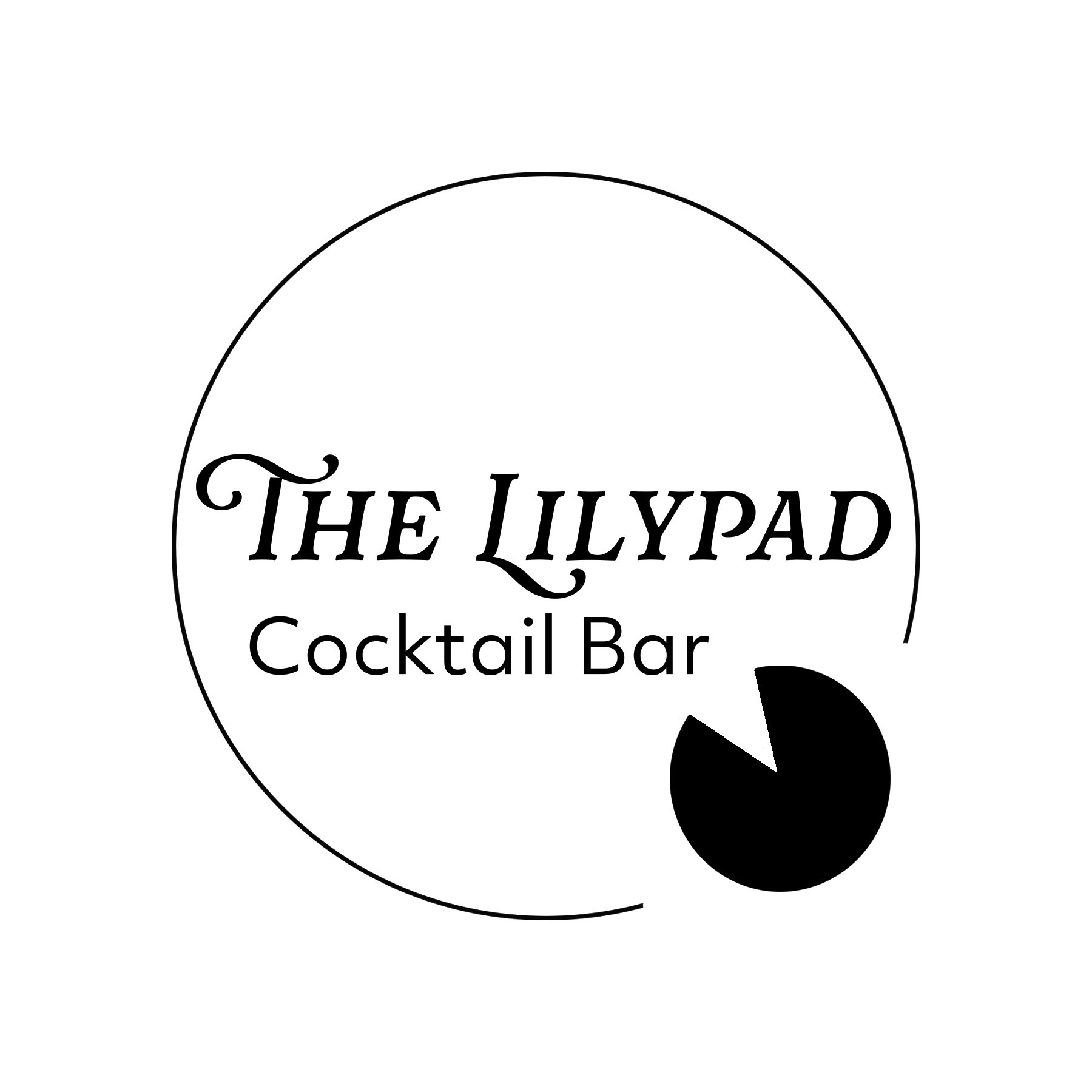
The logo (above) features a stylized lily pad, which helps capture the essence of the restaurant's name. The choice of combining a serif and sans serif font gives it a clean, contemporary vibe while still having playful charm. The duality mirrors the restaurant/bar nature of The Lilypad.
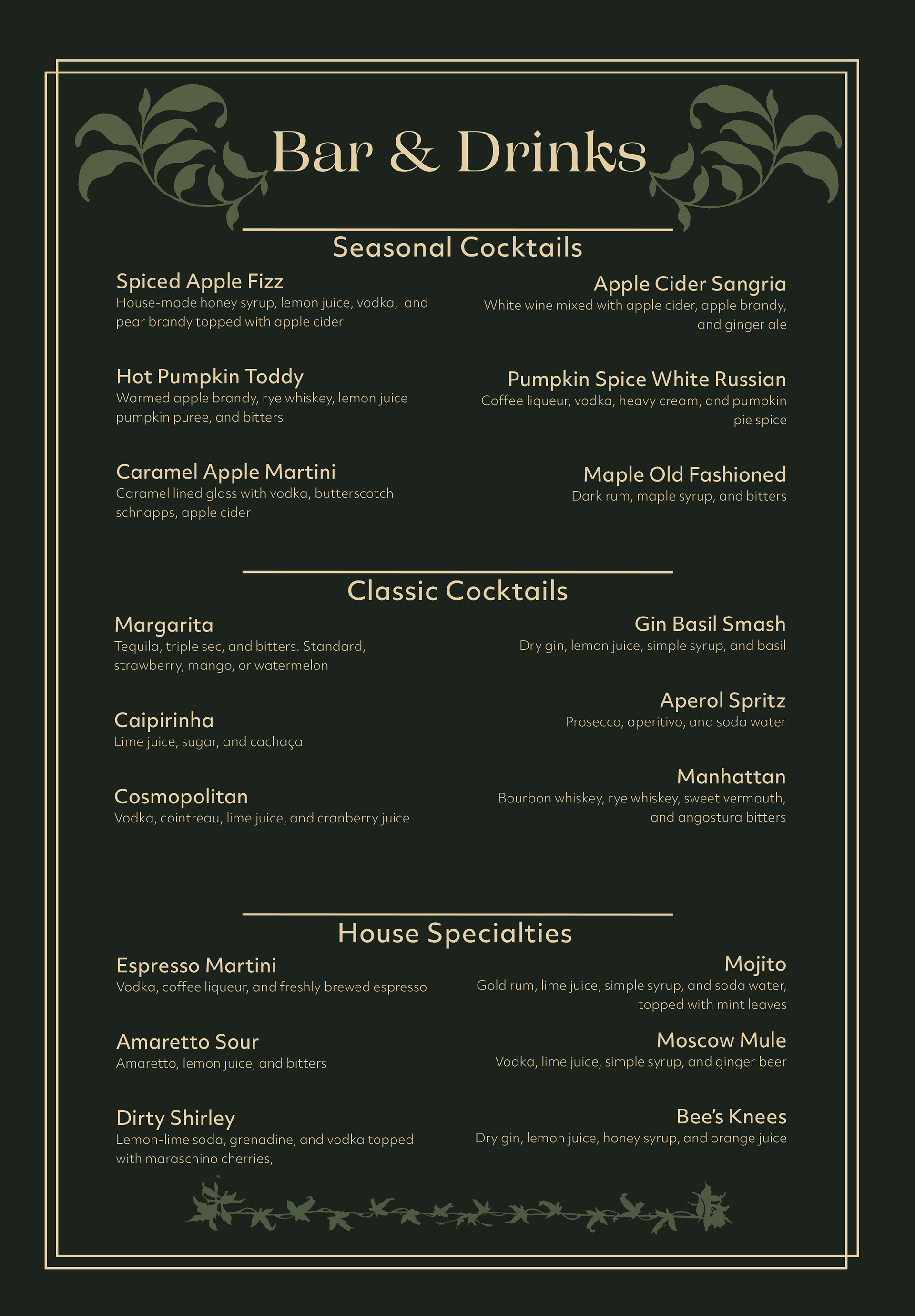
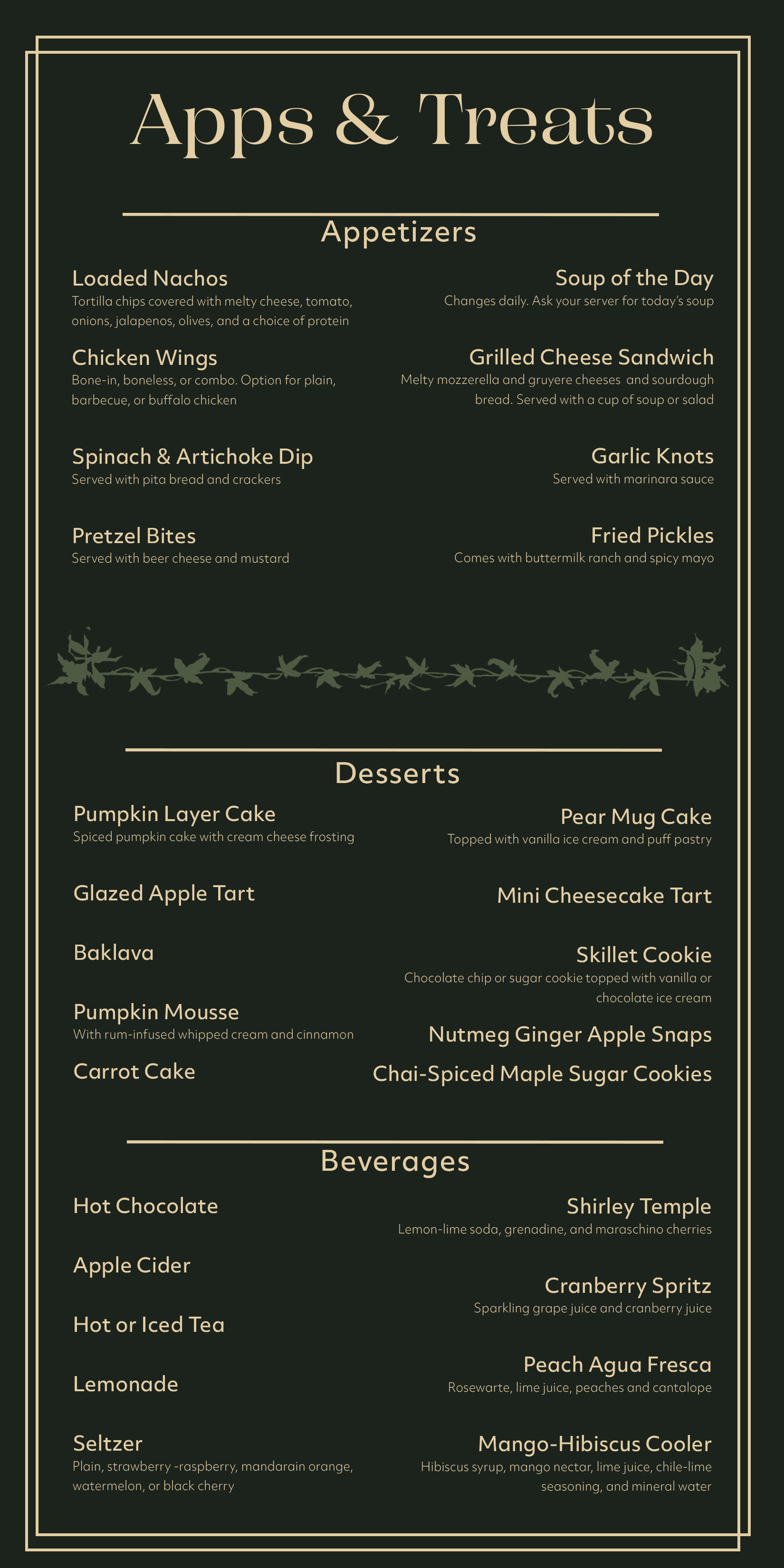
Two menus (above) were created to cater to the restaurant and bar identity of The Lilypad. A main drink menu (left) and a small food and non-alcoholic drink menu (right) were created. The primary color palette focuses on shades of green, drawing inspiration from the lily pad motif. This, mixed with the yellow of the type helps create a calming and inviting atmosphere.

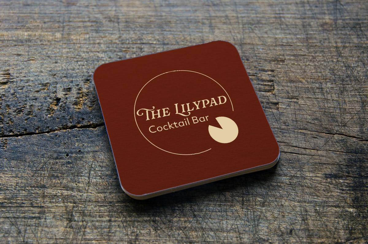
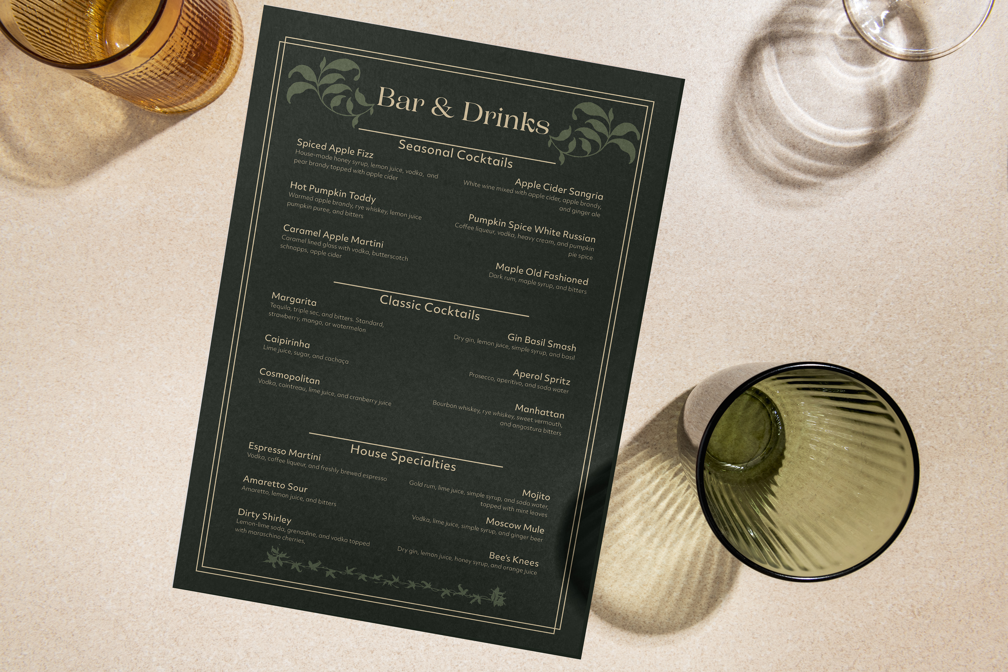
The mockups of the menus bring the concept to life, providing a realistic look at the designs. An additional coaster design is a subtle extension of The Lilypad's branding, with the logo on top that is a moody red that contrasts against the main green palette.
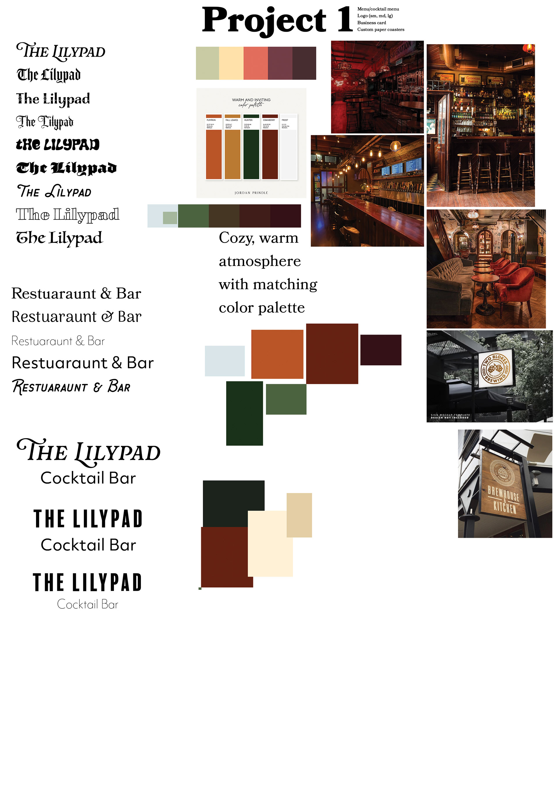
Above is the initial planning and mood-boarding. Multiple fonts were experimented with for both "The Lilypad" and "Restaurant & Bar", which was later changed to "Cocktail Bar". There were three different options created for the logo, as well as multiple color palettes created for inspiration that then turned into the main palette (bottom).