
I was part of Lasell University's TARNISHED Magazine for both my junior and senior years. I have done multiple multi-page layouts, from spread designs, illustrations, and feature writing. I have also had artworks showcased within the Art Gallery section of the magazine.
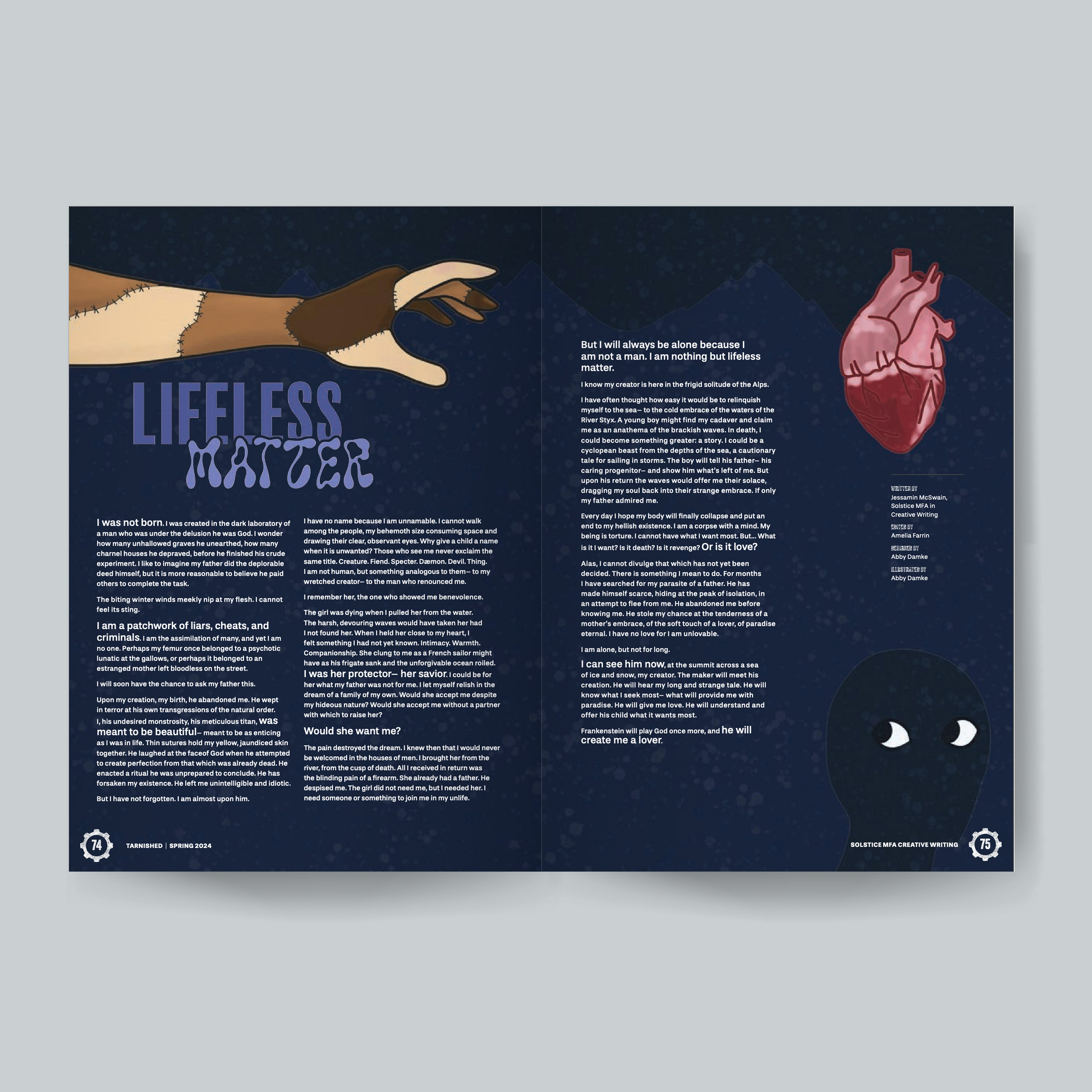
Mockup of a 2-page, 1-spread layout for the Spring 2024 edition of TARNISHED magazine. For this piece, I was asked to do a spread showcasing a writing submission. This included an illustrated background and altering the type layout and sizing to emphasize components of the text. For the illustration, I wanted to showcase some of the key points from the text: patchwork body parts (the arm reaching out), the need for love (represented by the heart), and seeing the shadowed figure in the snowy mountains. Because of the emphasis on wanting love, I decided that having the arm reaching out toward the heart would be a strong representation. The dark mountains in the background also help tie the location in, as well as providing an even, dark background for the type. For the title, I wanted there to be two different typefaces; one simple and strong, the other more organic and curved, to showcase the varying levels of natural and unnatural prevalent in the writing. For the text itself, using the typography guidelines, I decided to emphasize some of the more raw, emotional feelings that the character is feeling throughout the writing.
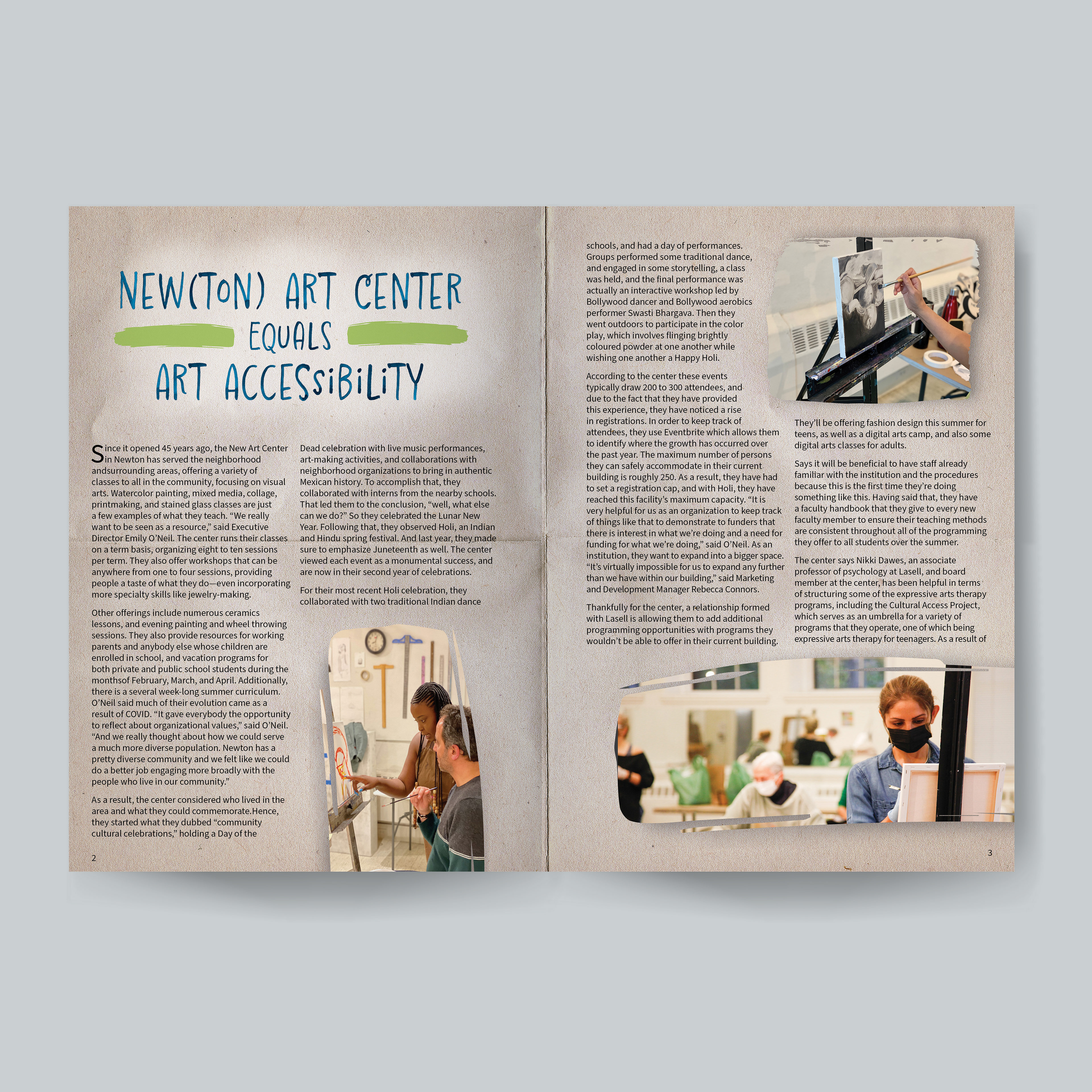
Mockup of a 4-page, 2-spread layout design for Spring 2023 edition of TARNISHED magazine. I used a paper texture for the background of the pages to emphasize the use of traditional materials in the setting of the art center that is being written about in the feature. I was lucky enough to be able to access some of their design assets, such as the paint swatch marks. I was able to take those and use them as an image mask, making the photographs provided look as if they were painted on. Including this detail not only ties together the article and the center with their design element but is a nod to the painting that is highlighted in the majority of the photographs. I also used the paint swatches provided to me on their own on the title, a pull quote, and on the bottom of the second spread.
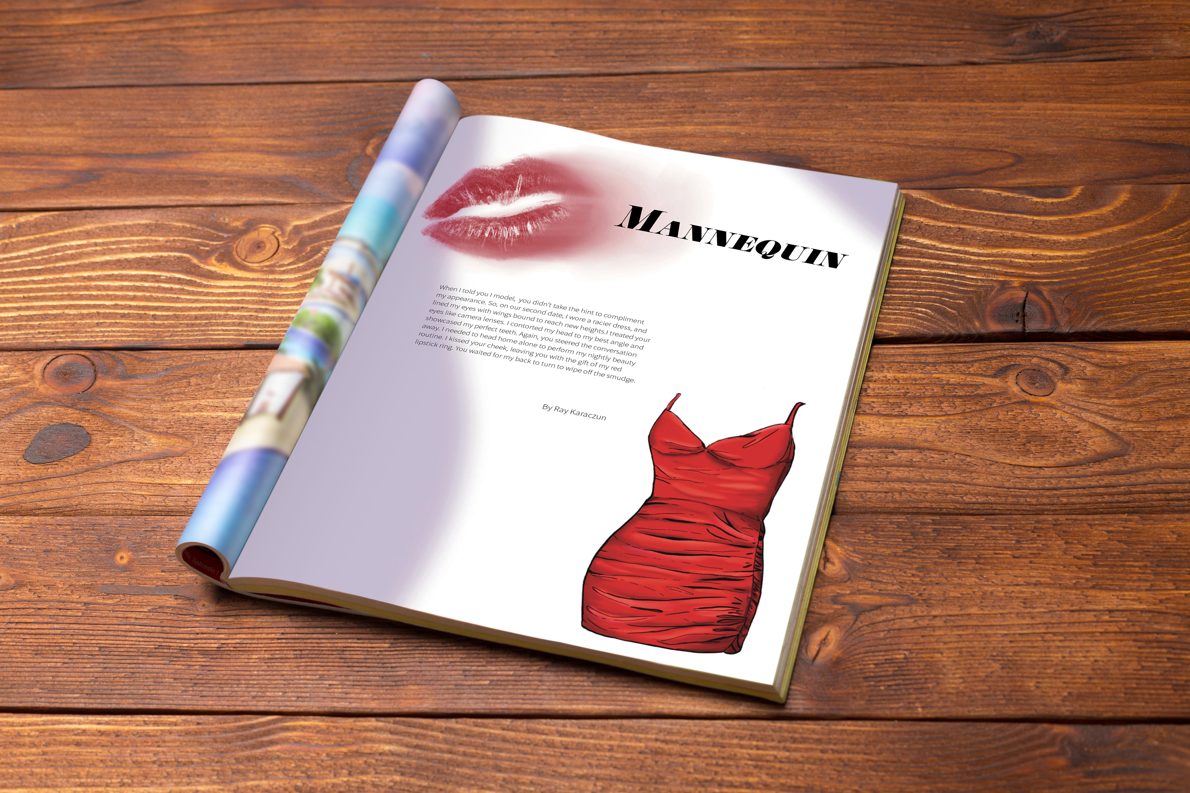
Mockup of an illustration and one-page layout I did for the creative writing section for the Spring 2023 edition of TARNISHED magazine. Here, I did the background purple which is a little blurred as a way to fill up some of the white space. Taking what is described in the writing, I did an illustration of a dress and smudged lipstick to help with the visualization aspect of the layout.