
For my senior thesis, we were encouraged to explore something that interested us and showcased the skills we learned over the 4 years we spent learning and growing.
I decided to explore children's picture books and the work that goes into them. I started with research regarding the preparation for a children's book; finding common themes to include in the story, typefaces that would provide easy readability, and eye-catching and engaging layouts.
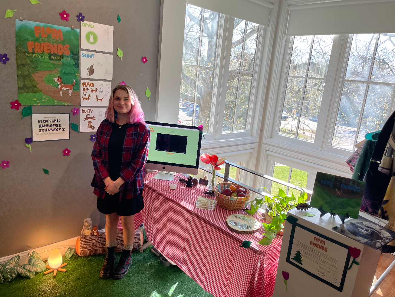
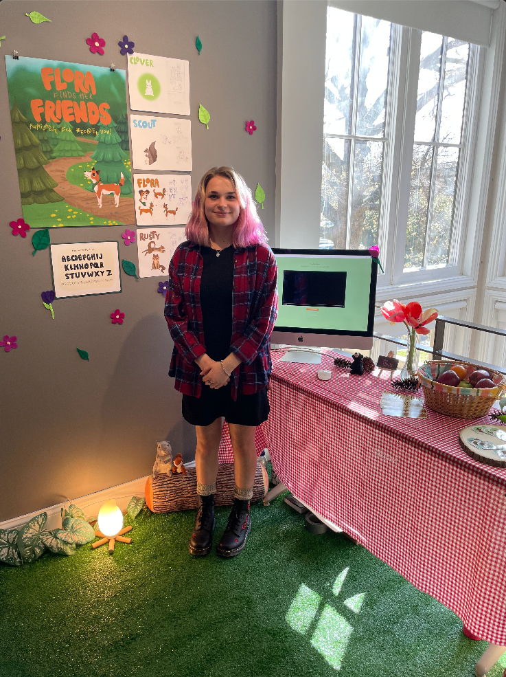
The components of this project I had were: A progress copy of the picture book, with a fully illustrated front and back cover, 14 complete pages, about the author and acknowledgments pages, and 5 behind-the-scenes pages showcasing sketches and the storyboard; an 18x24 inch poster promoting the book; 2 sets of stickers, each one depicting a different character; bookmarks promoting the book, detailed with a patterned background; a 30+ second motion graphic; a website; completed writing.
The pages, including the front and back cover, as well as handwritten typefaces were created in Procreate. The illustrations and assets from Procreate were then uploaded to Adobe InDesign for layouts and pre-press.
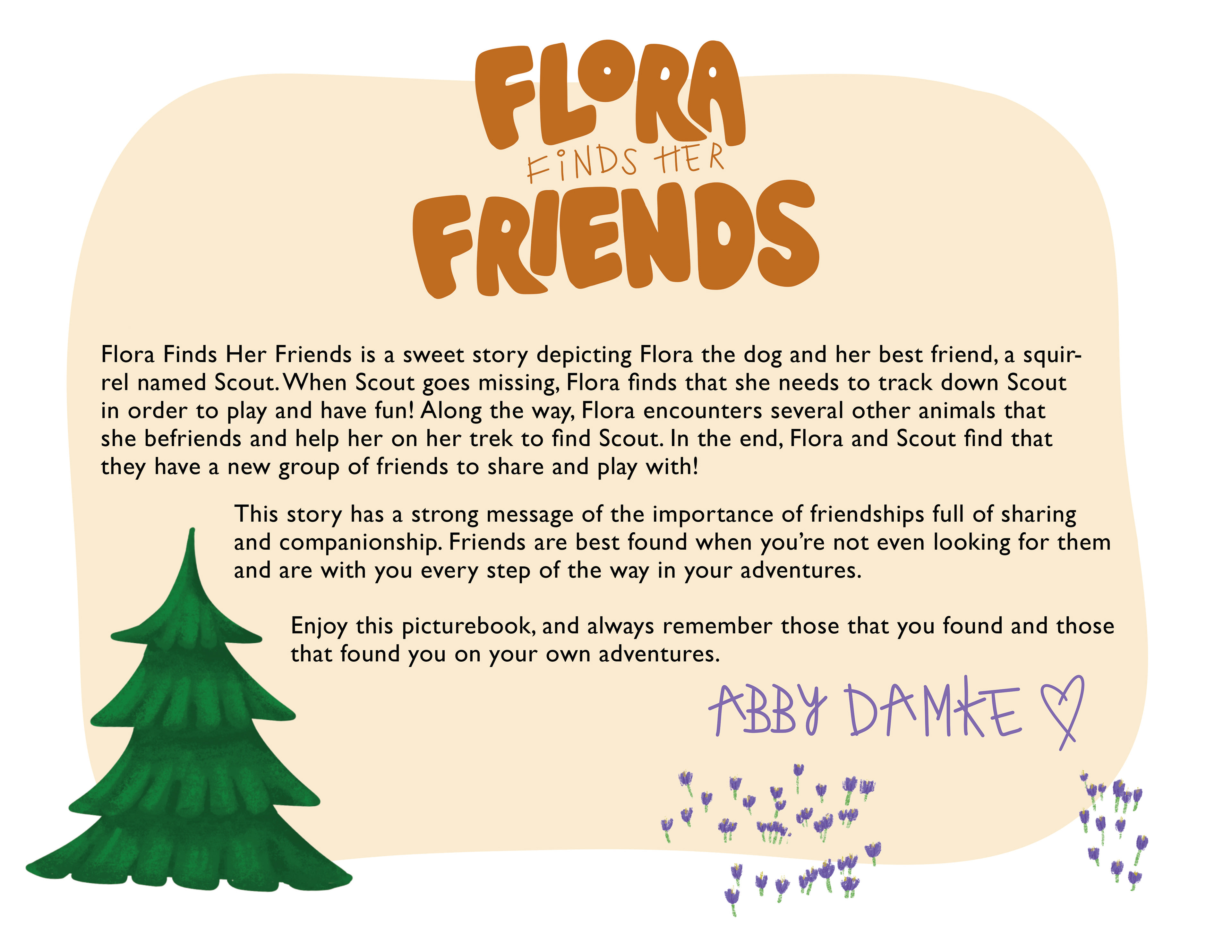
Book message for Flora FInds Her Friends

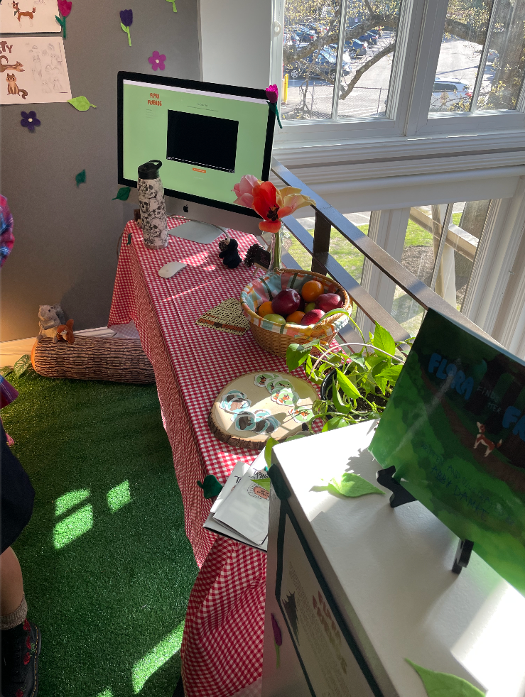
Printed deliverables that were designed to be takeaways/goodies for those who came to the Senior Graphic Design Showcase.
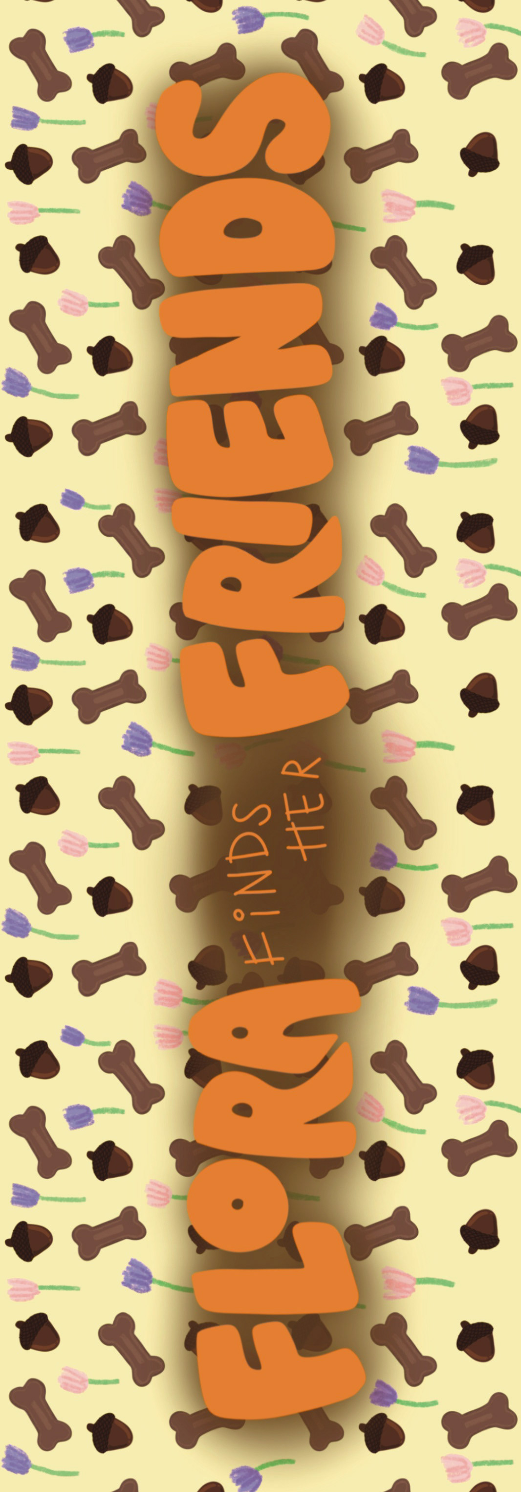
On the left is the front and back of the bookmark that was designed. I created a repeating pattern that includes some items that are seen throughout the book, such as the dog treats, acorns, and flowers.
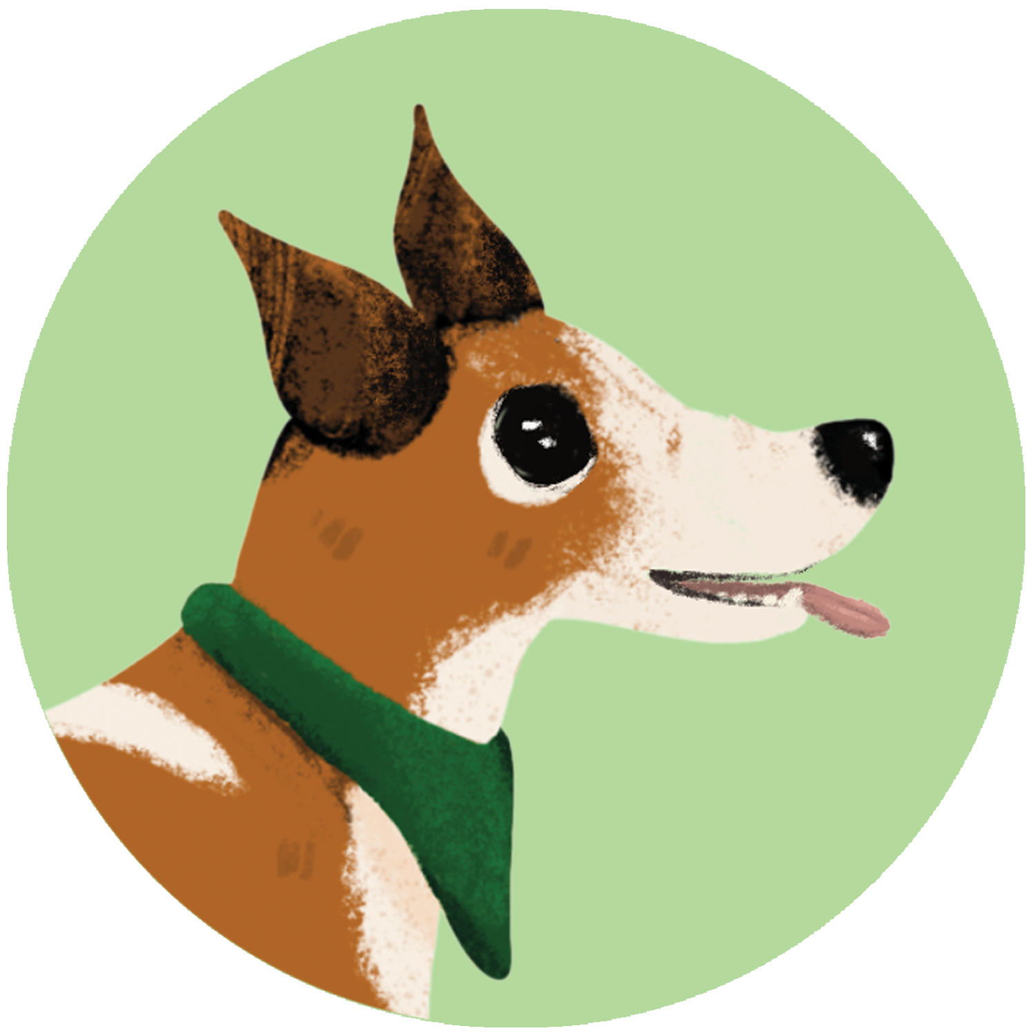
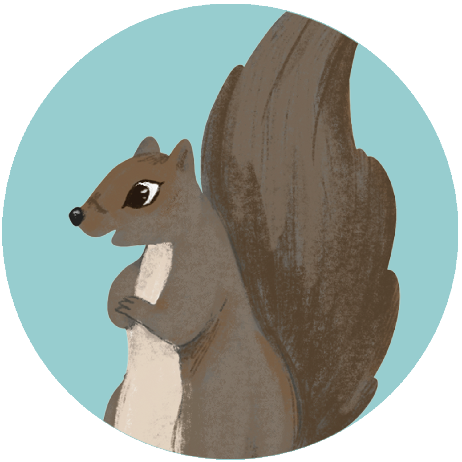
The center and right images are the two stickers that were designed to depict two of the main characters of the book. Flora, the dog, and Scout, the squirrel that Flora tries to find through the course of the book.
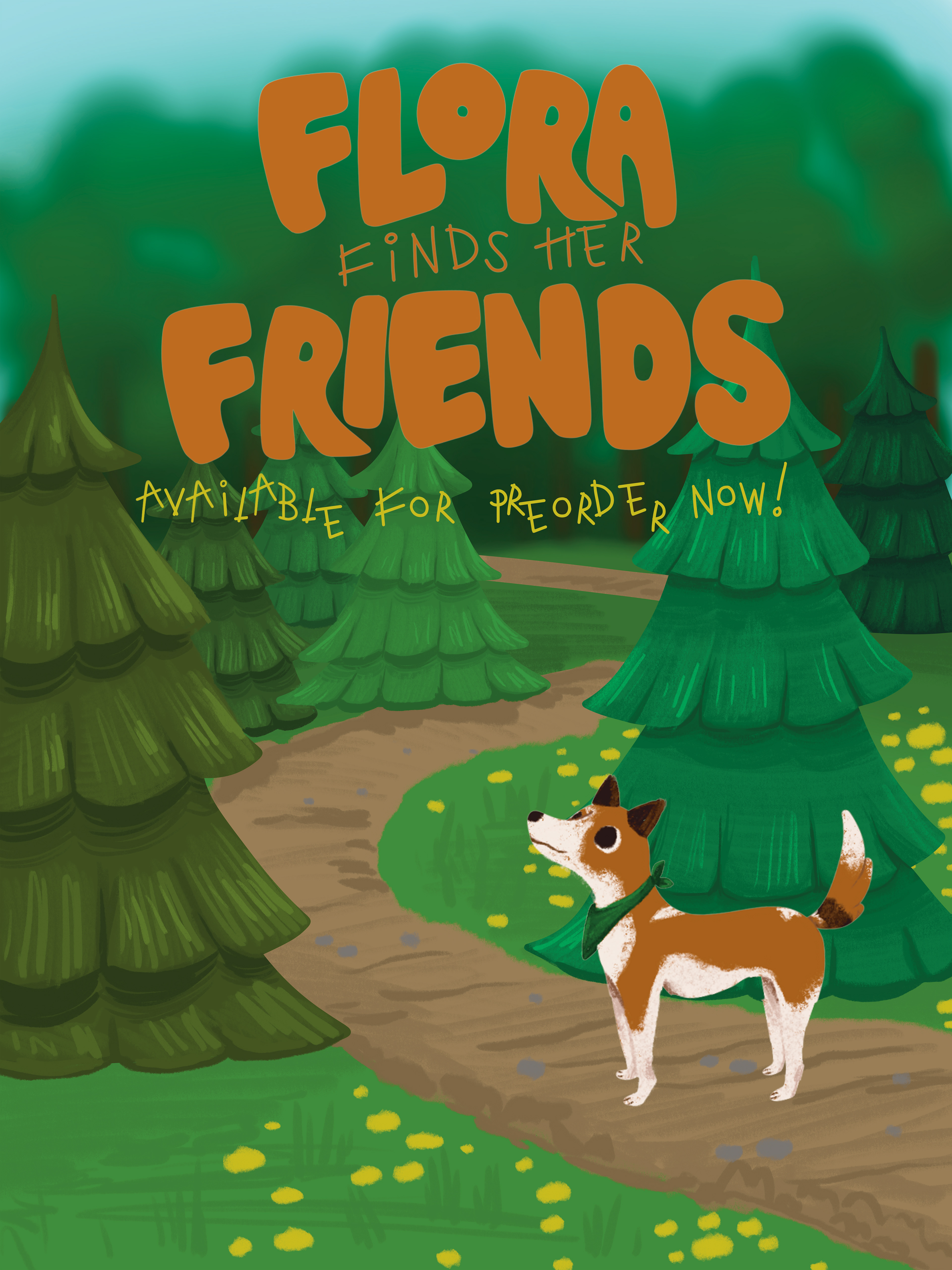
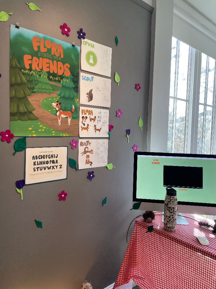
The poster fulfilled the poster component of the project. I wanted it to include the FFHF logo that is consistent throughout all of the media created for the project, as well as being used for marketing the book. For this, I included "Available for Pre-Order Now!" in the subheading handwritten typeface I designed to keep it cohesive with the front cover of the book.
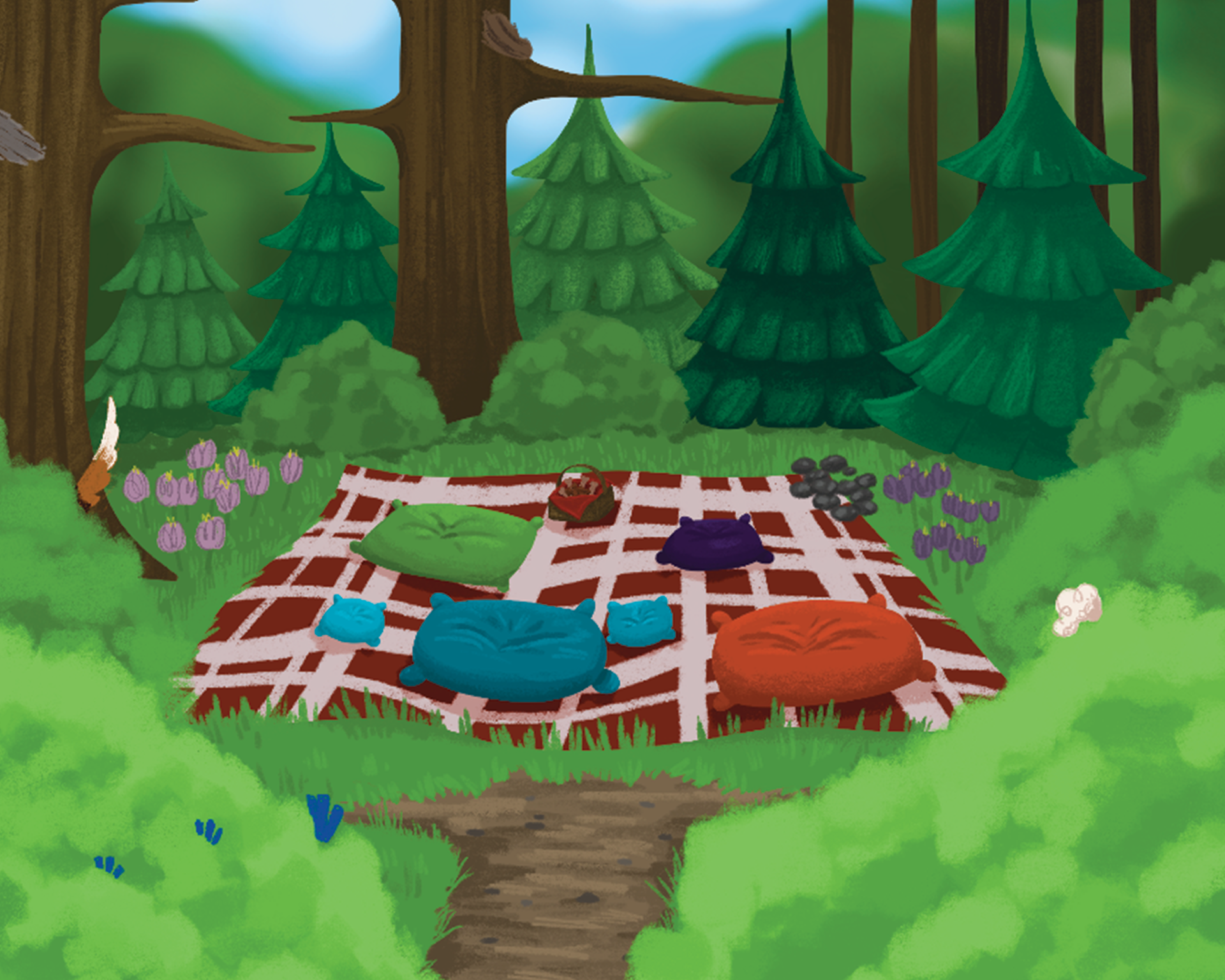
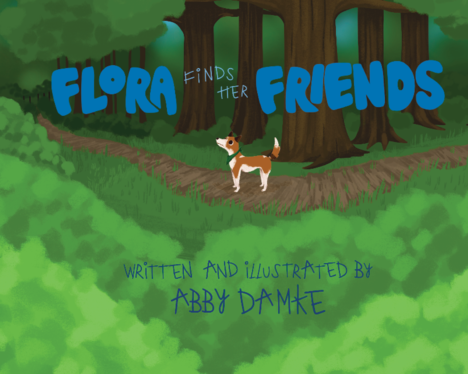
Front and back cover designs. I wanted the back cover to hint at the ending of the book, as well as show the characters in the book hiding around the back cover. Some components show up throughout the book, such as the basket and the purple pillow. Each pillow represents a character, and the colors of them correspond to each character. The front cover showcases the signature title icon as well as showing one of the main characters and the namesake of the book, Flora. I chose the blue since it contrasts the orange that the logo is usually in, and helps stand out in front of the trees.
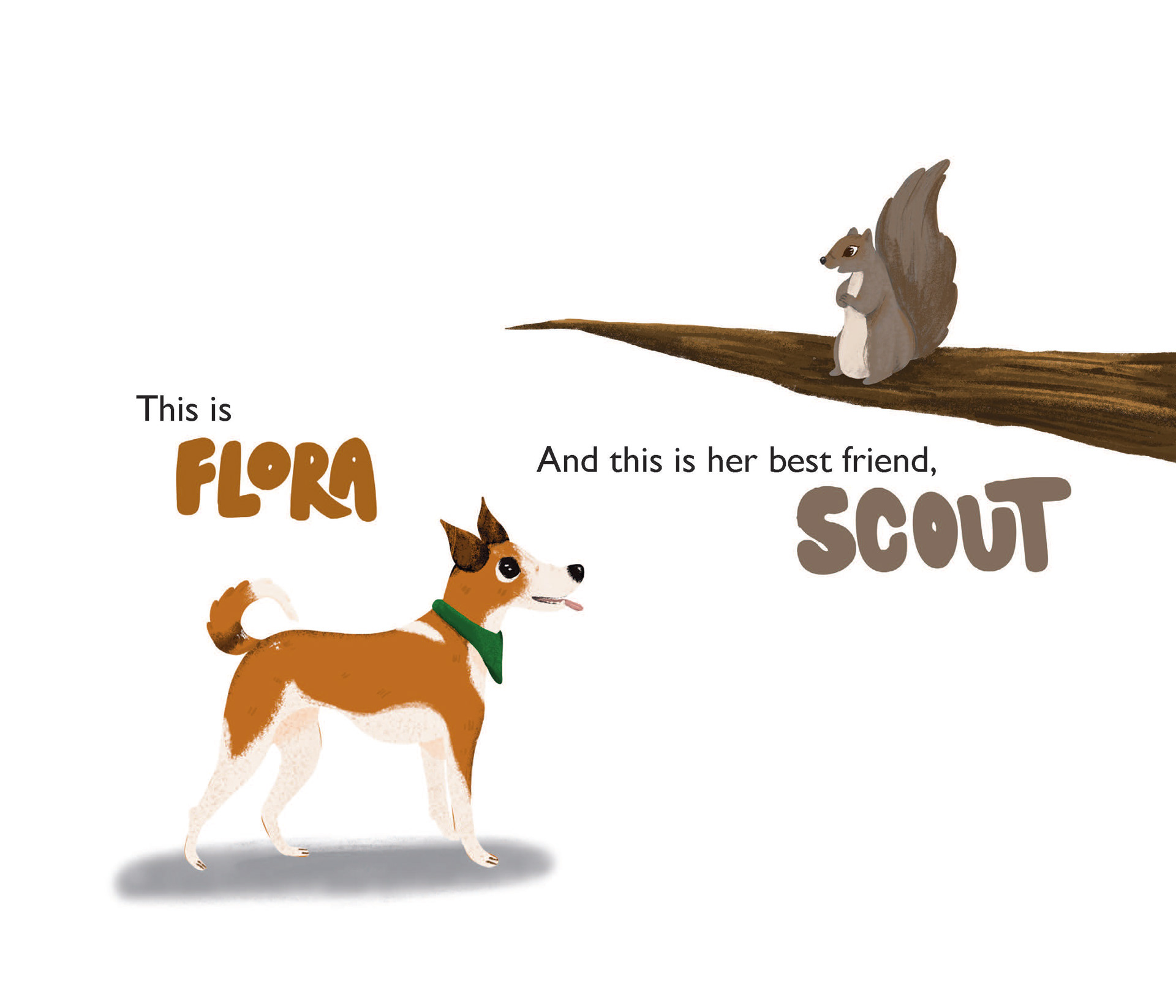
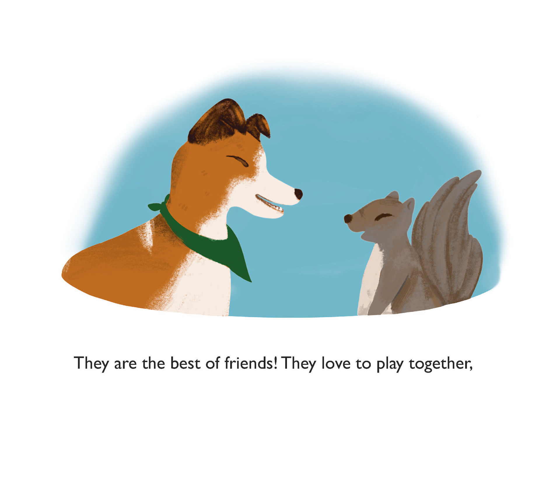
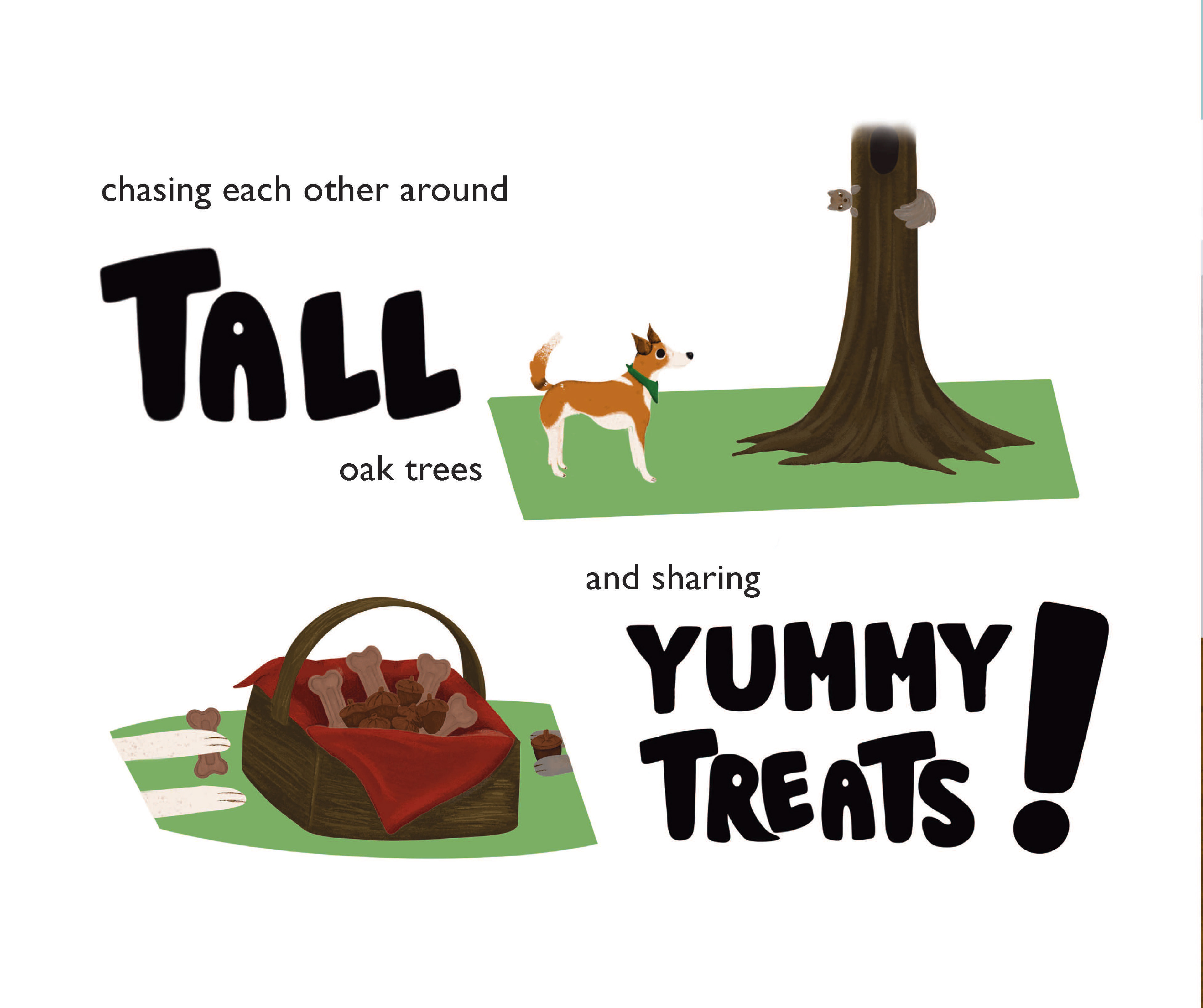
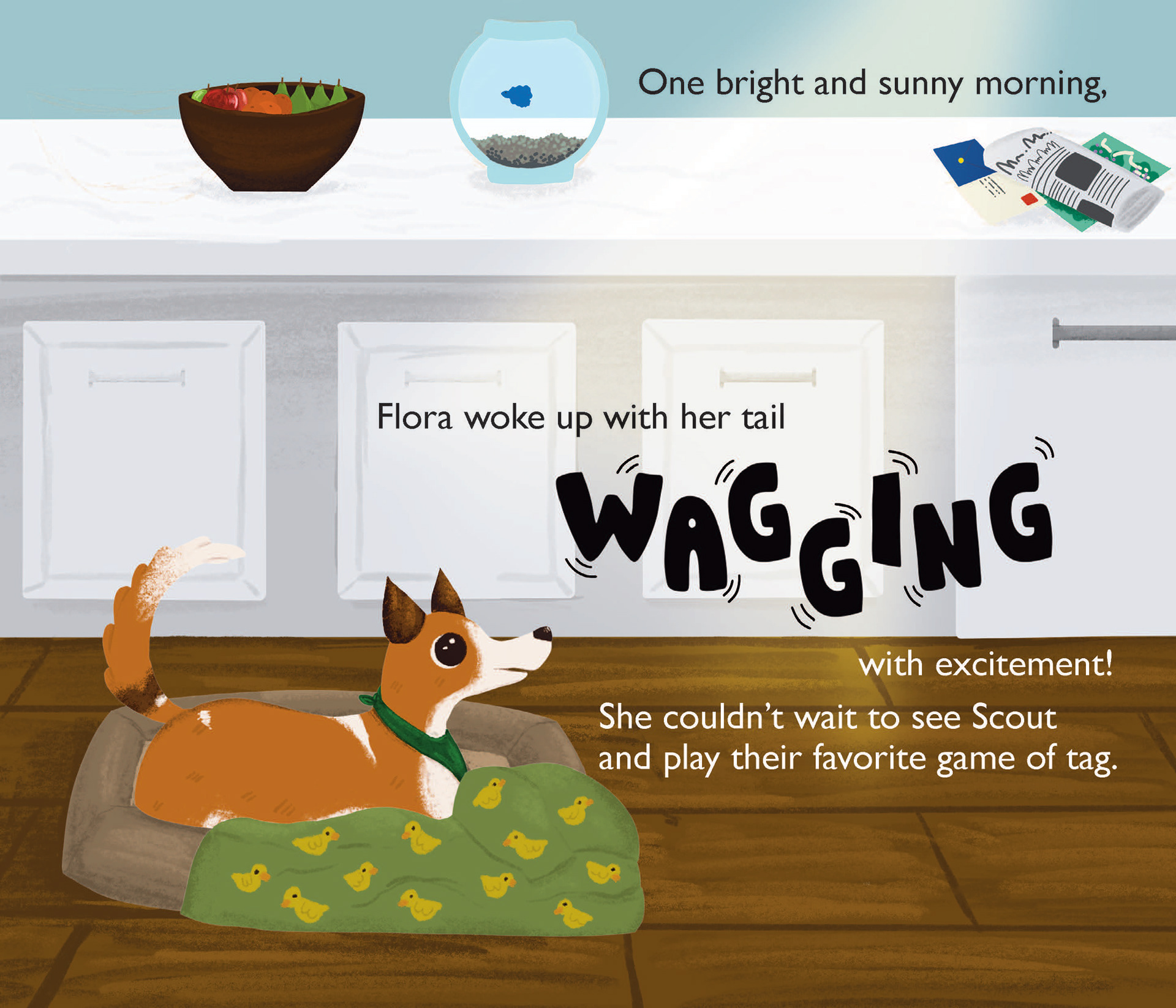
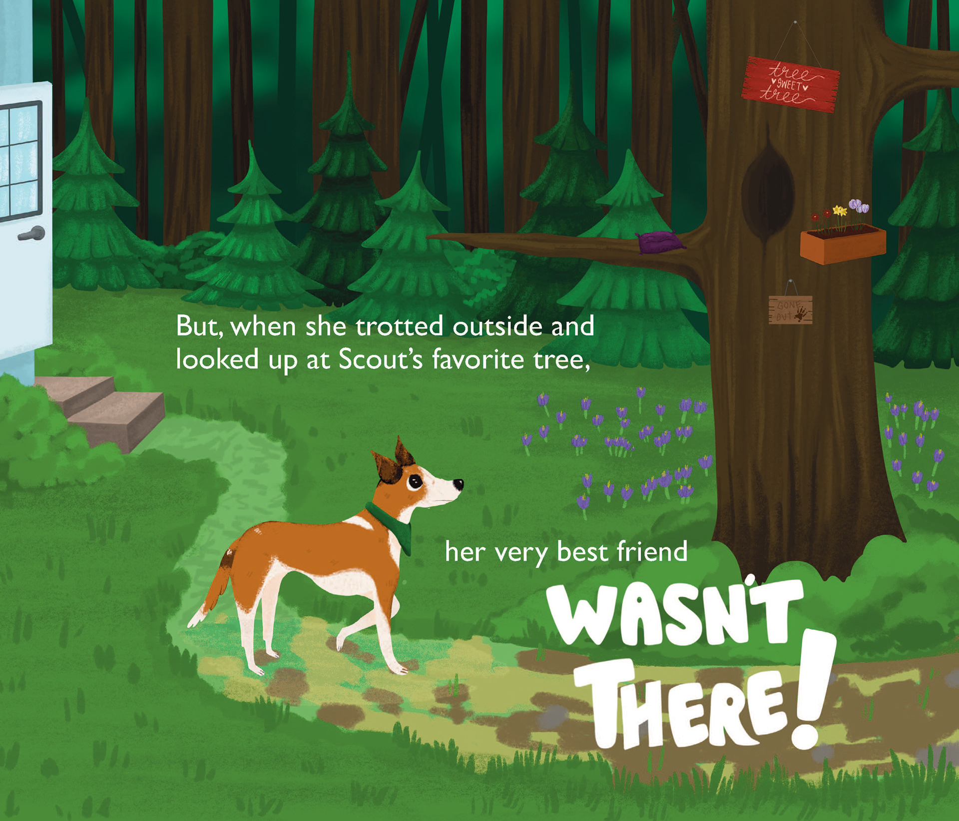
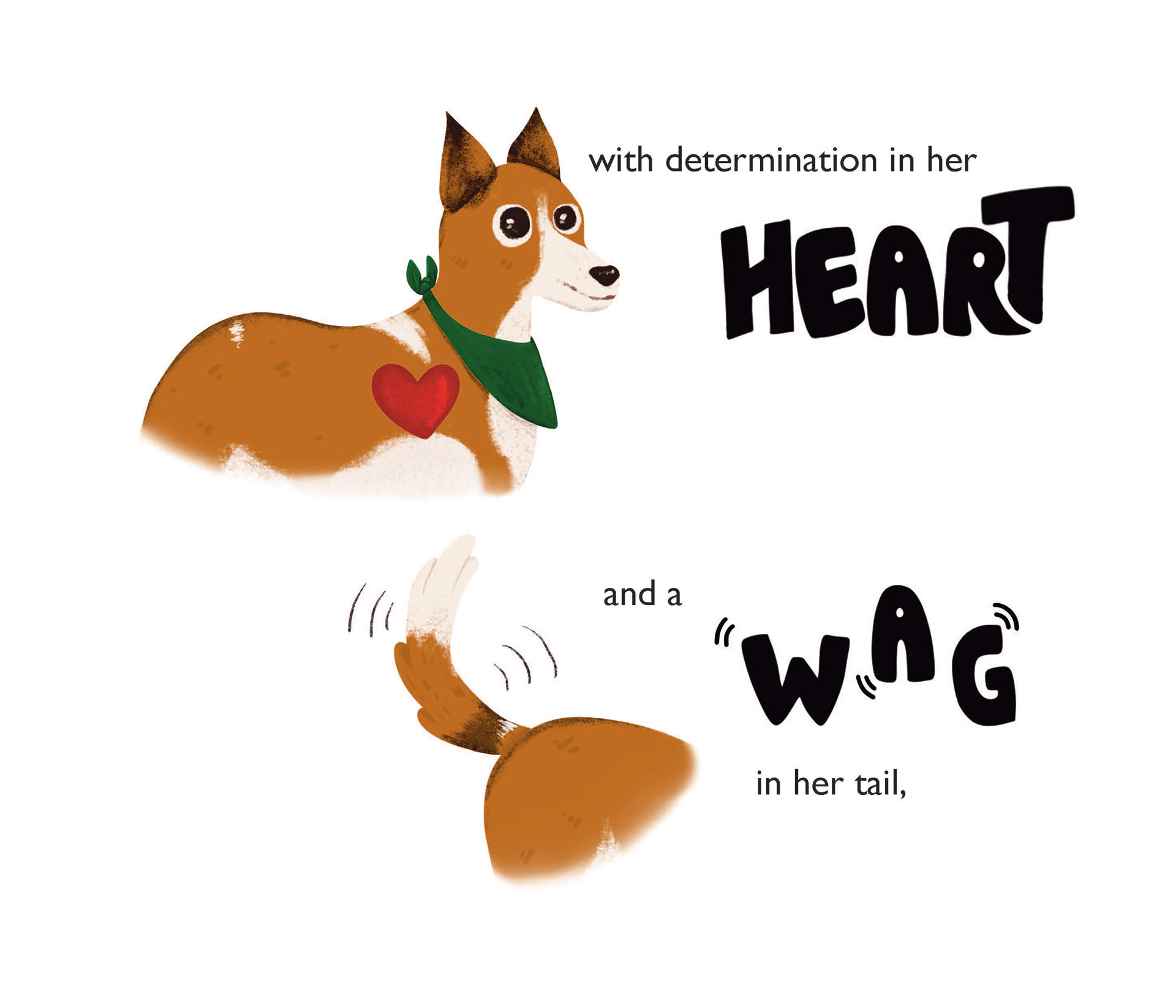
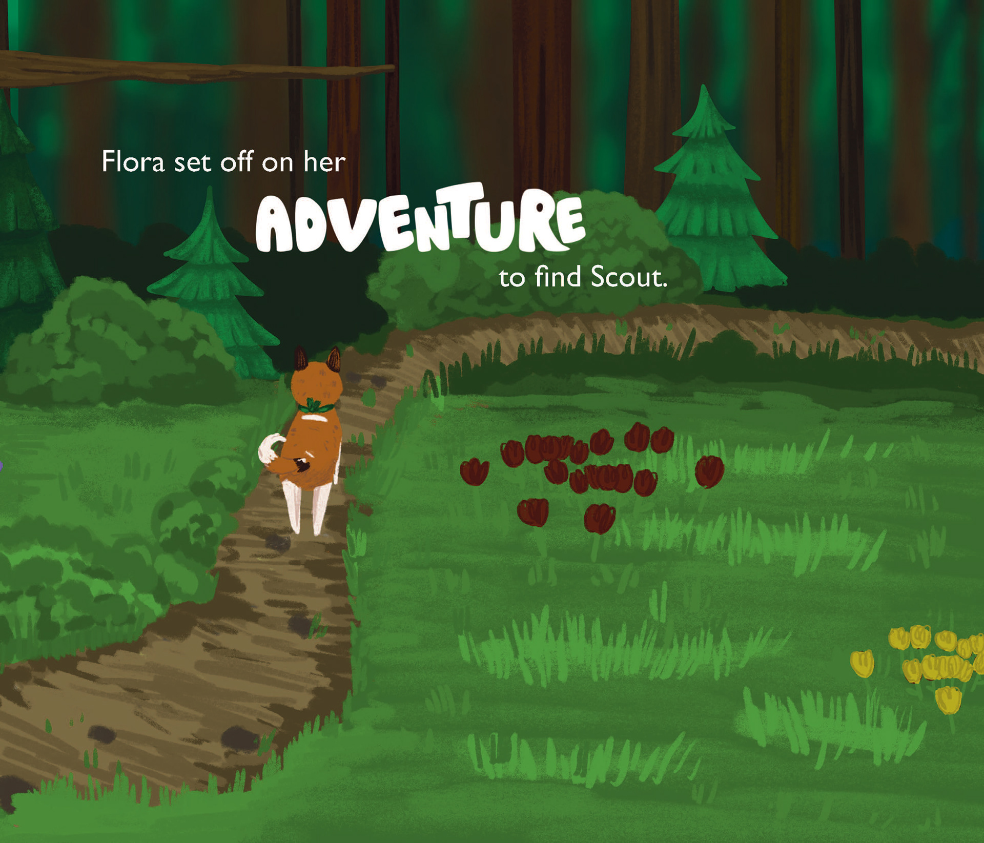
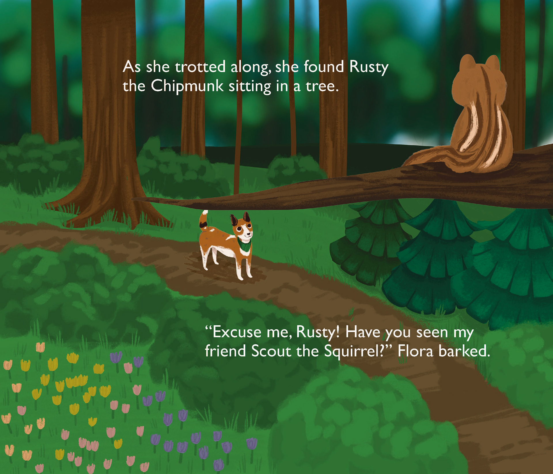
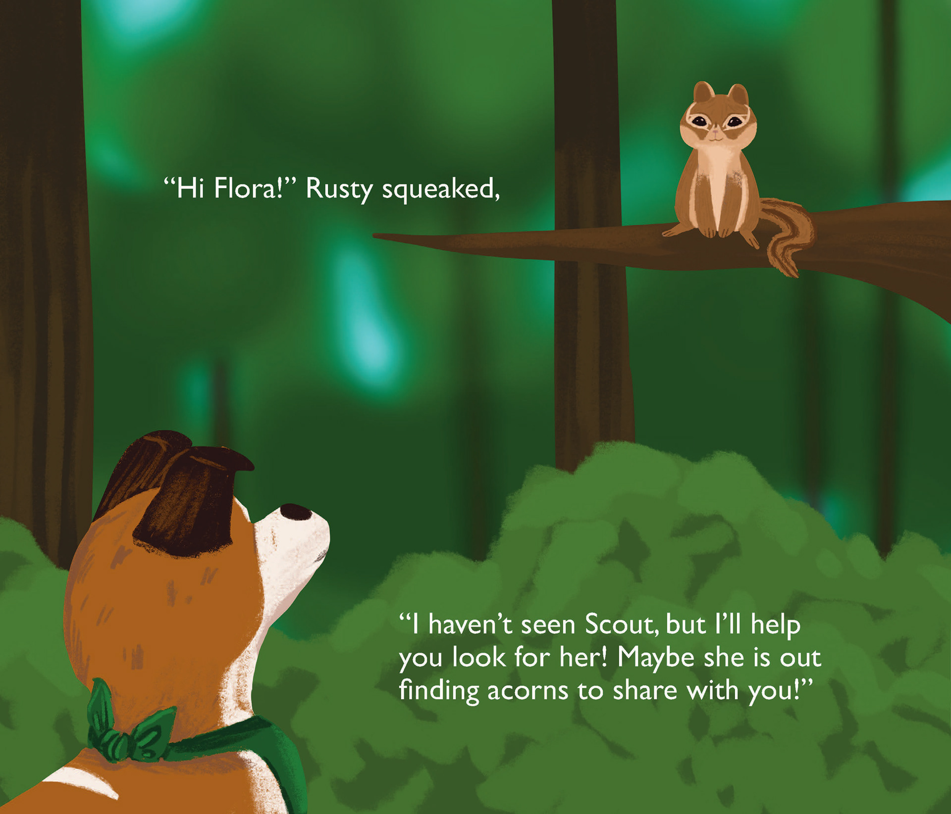

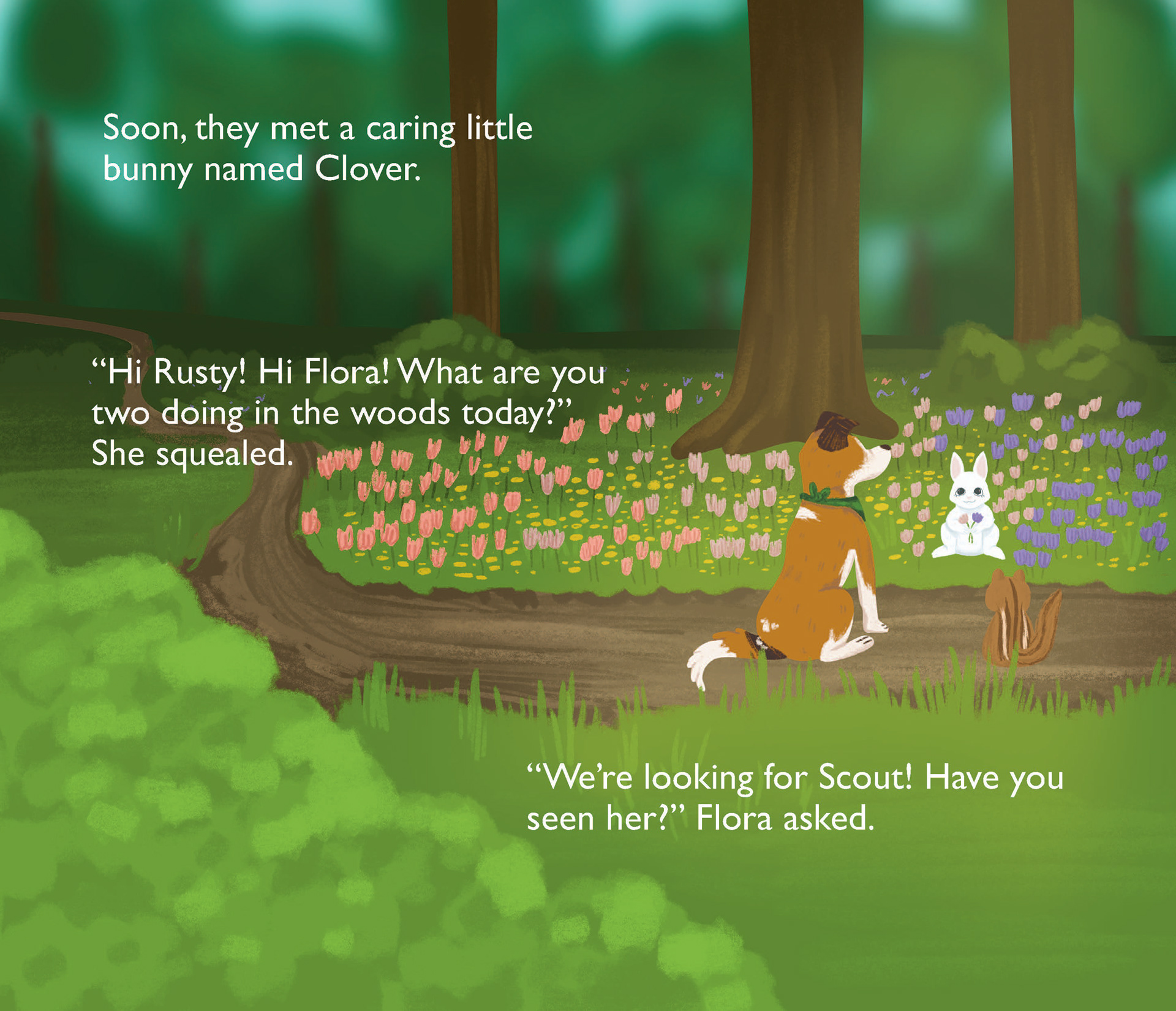
Above are the final main story pages, complete with full illustration and writing. I wanted there to be an equal balance of full-page illustrations as well as pages that have white space. I also maintained a color palette for each character as well as the nature tones used to keep the book cohesive. The characters and forest scenes are all stylized to fit the children's picture book aesthetic of being playful and fun. I also used some handwritten type (pages 1, 3,4,5, and 6 above) to break up the text and make it eye-catching.
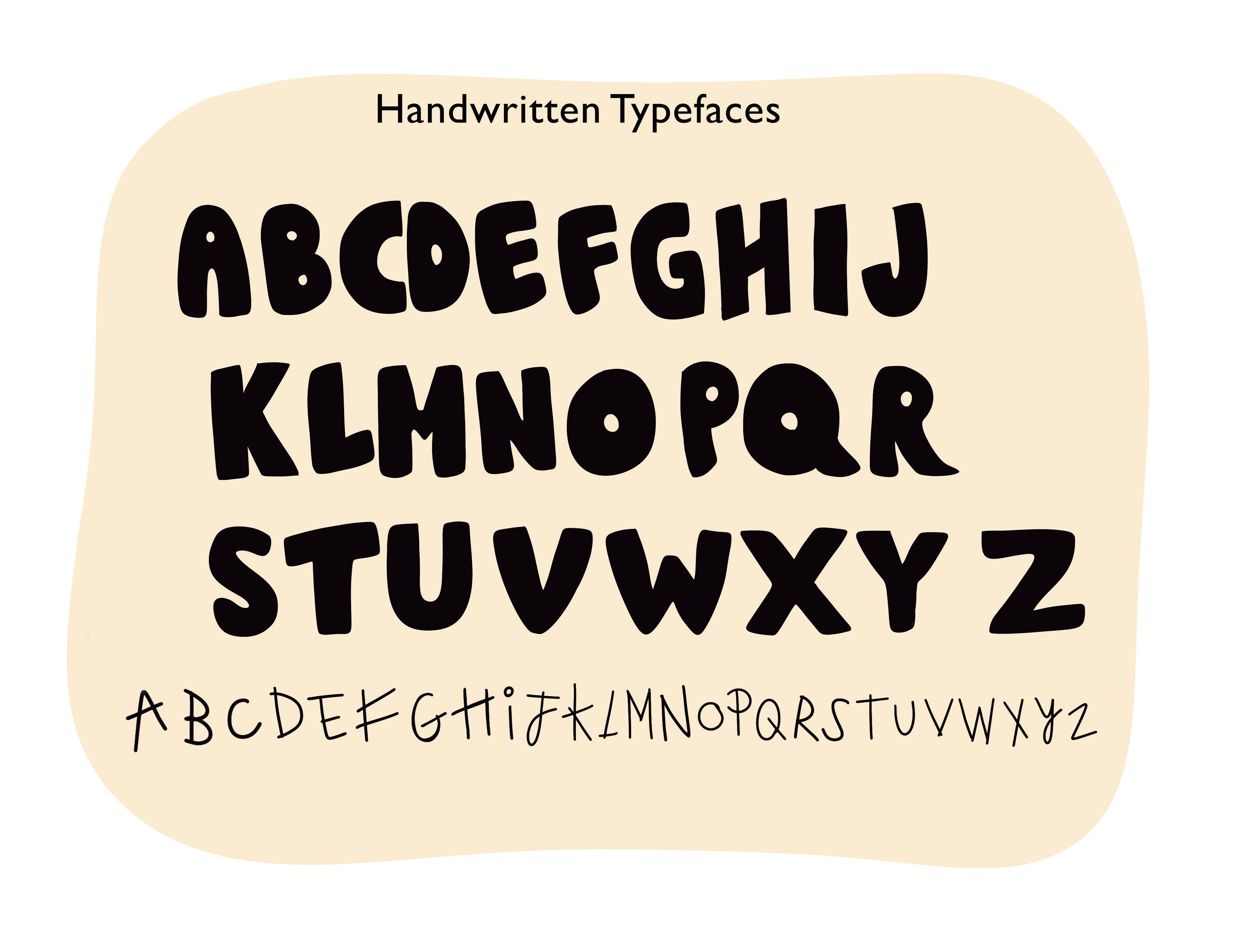
Above is the full alphabet for both handmade typefaces used for the book. I wanted to create two: one that worked more as a header, emphasizing words when necessary, and one that was more childish and quirky to act as a subheader type. Both can be seen throughout the book and the words were created using this type. When I wanted to use either typeface to create a word or sentence, I would go into the master document, duplicate each letter, and put the words together, altering them depending on the letters next to each other. An example would be making letters smaller to fit under the T, or making letters smaller to fit on the leg of the R (RE: Page 1, the LO and the RA in "Flora"; Page 3, TR and AT in "Treat") While an extremely tedious task, it proved a great success in the end.
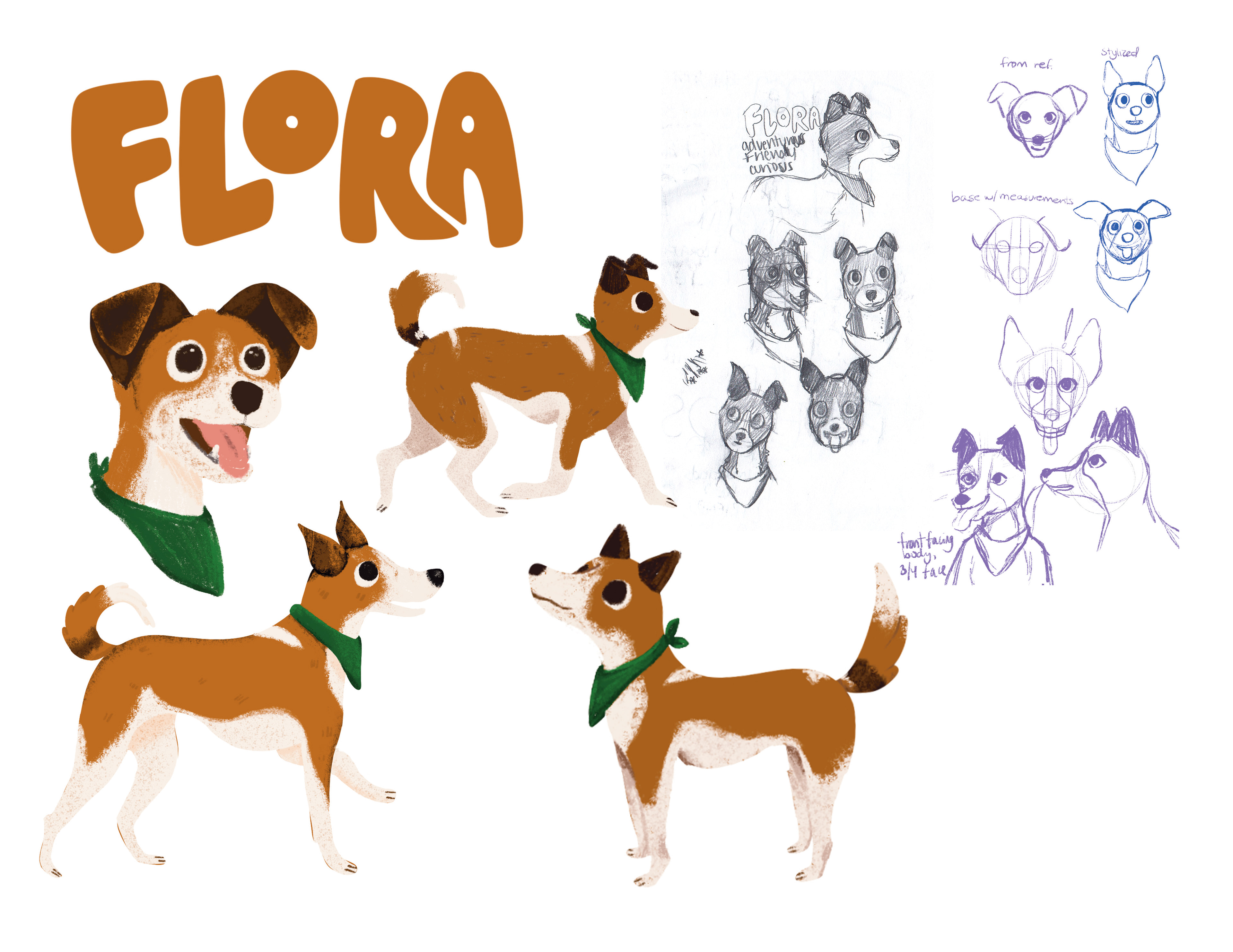
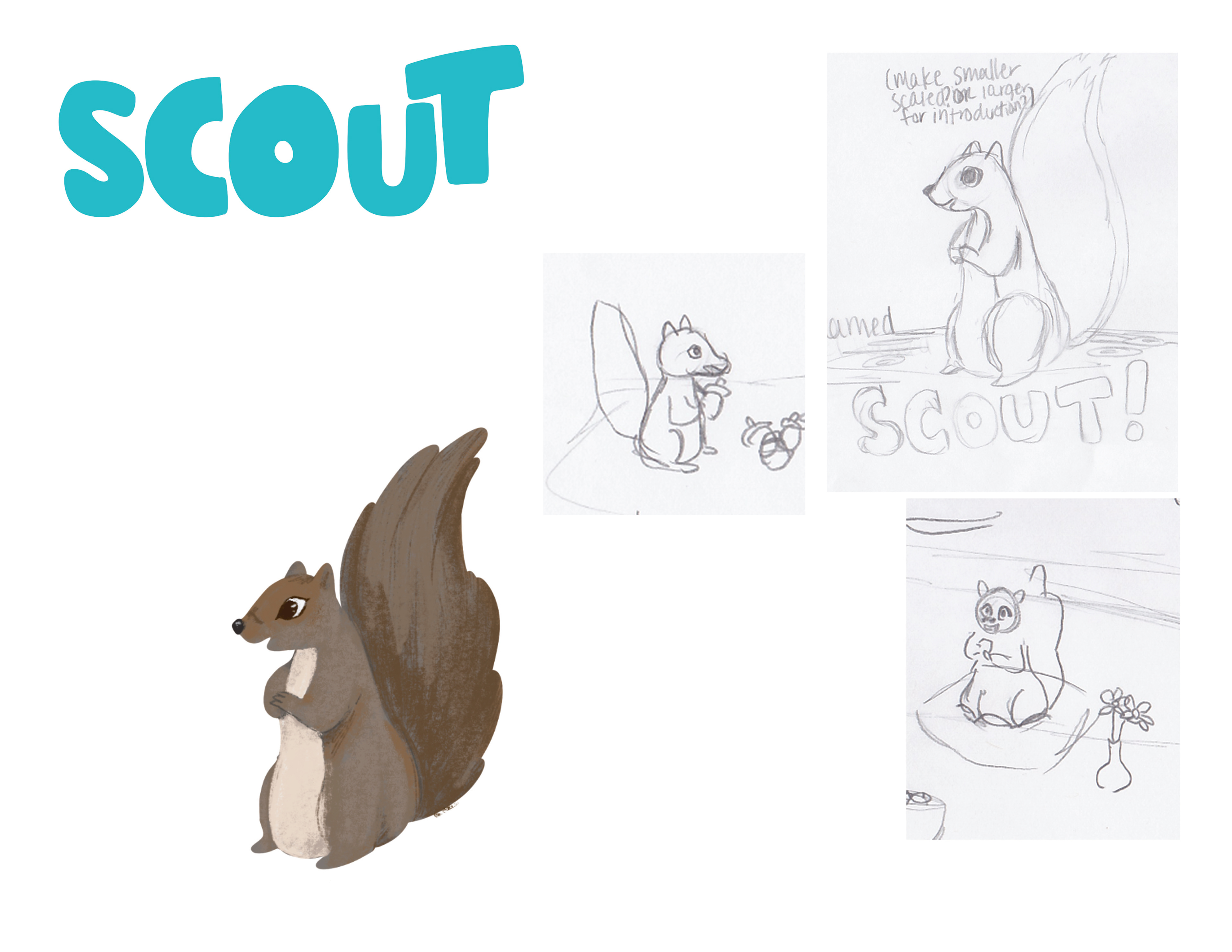
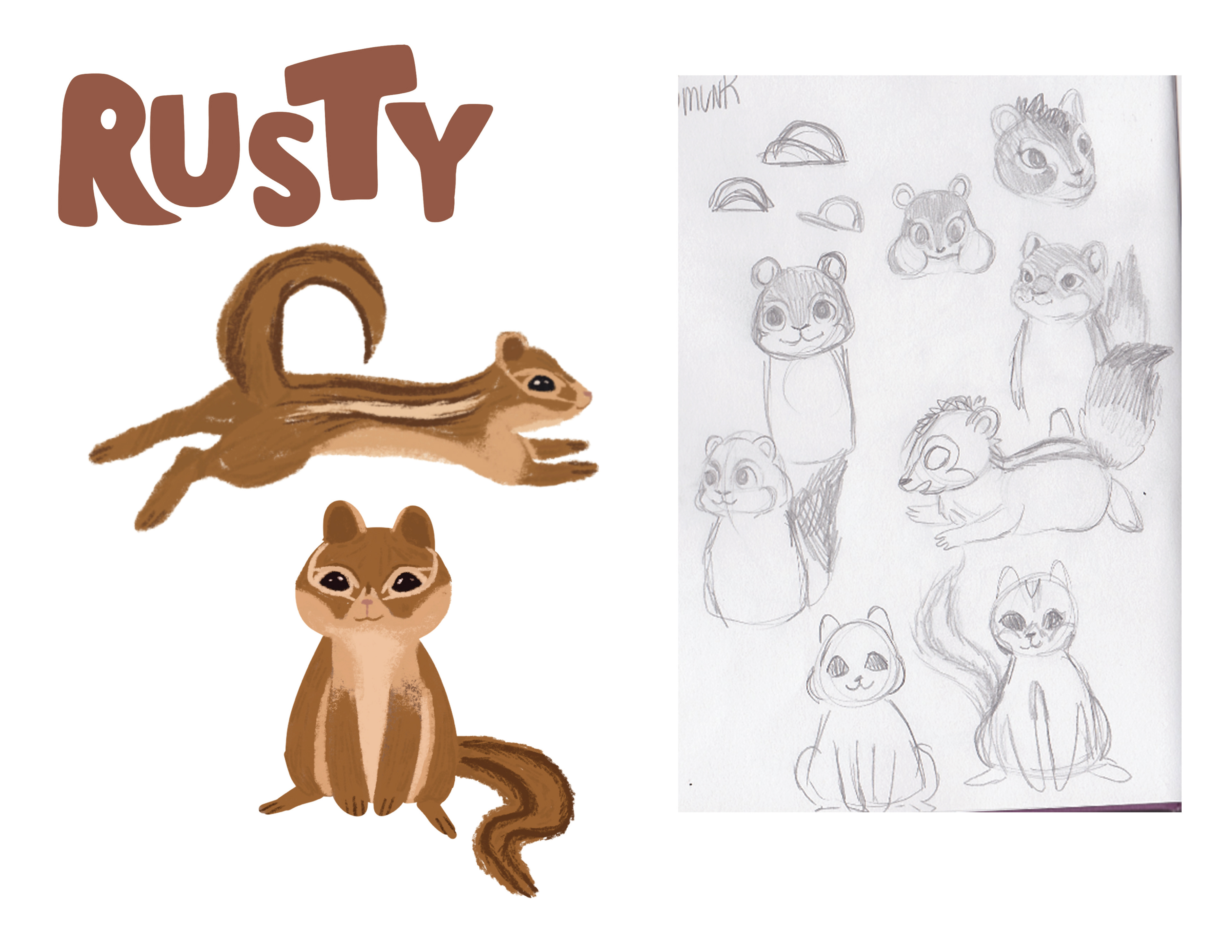
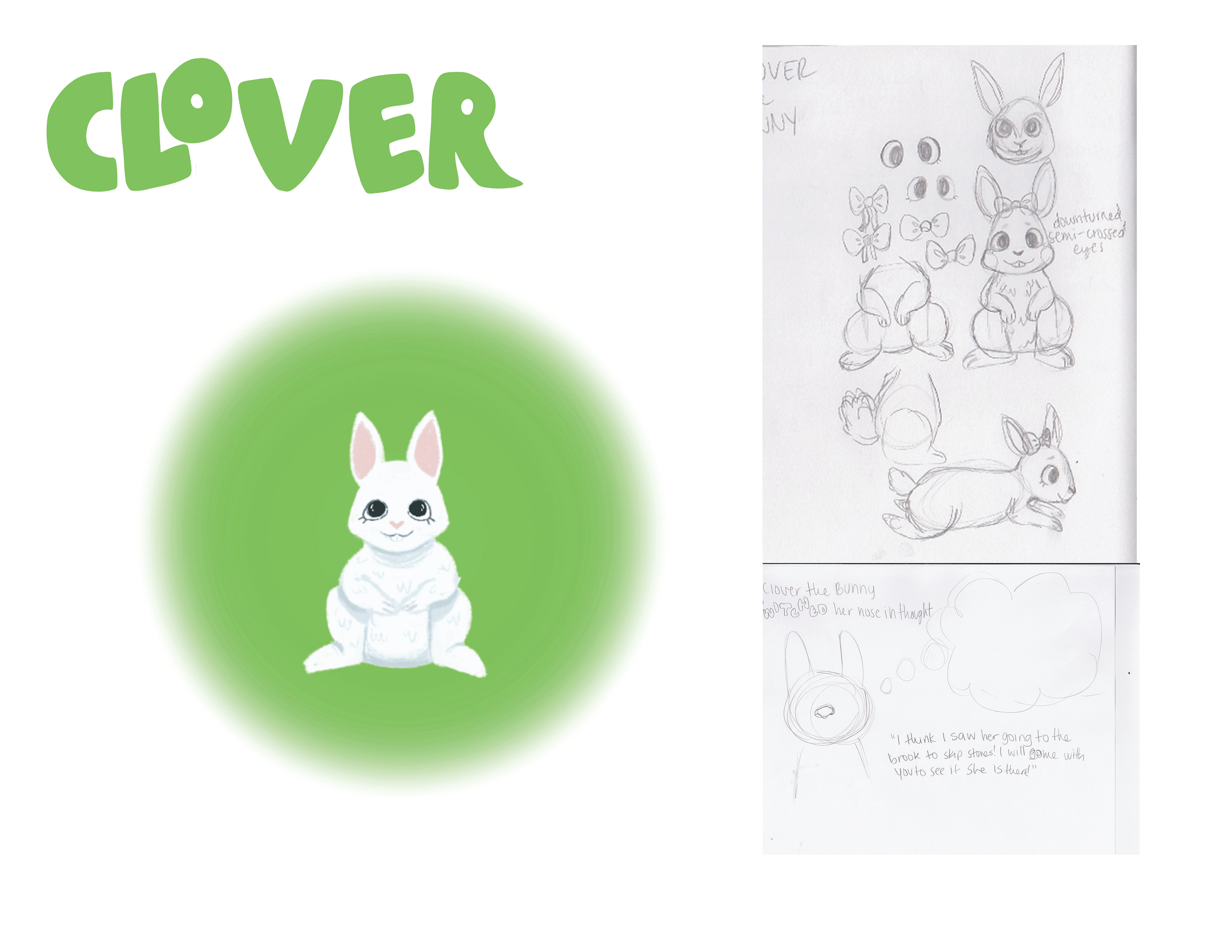
Character sheets that were included in the Senior Graphic Design Showcase presentation. I included the final illustrated versions featured in the book as well as initial sketches of the characters.