While at Lasell, one of my first graphic design courses included a "Designer Series" Magazine, where everyone picked a designer to focus on, creating a cover and 2-page spread. Senior year, I had a Senior portfolio development course where we took six former assignments and recreated them with the skills we developed over our four years. I made one of my pieces recreating the "Designer Series" Magazine spread. Being out of school, I decided to recreate it a third time to show my stylizing changes and overall design evolution over the span of five years.
ORIGINAL - VERSION 1
SENIOR PORTFOLIO DEVELOPMENT - VERSION 2
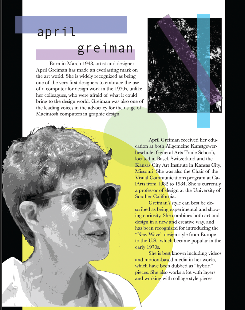
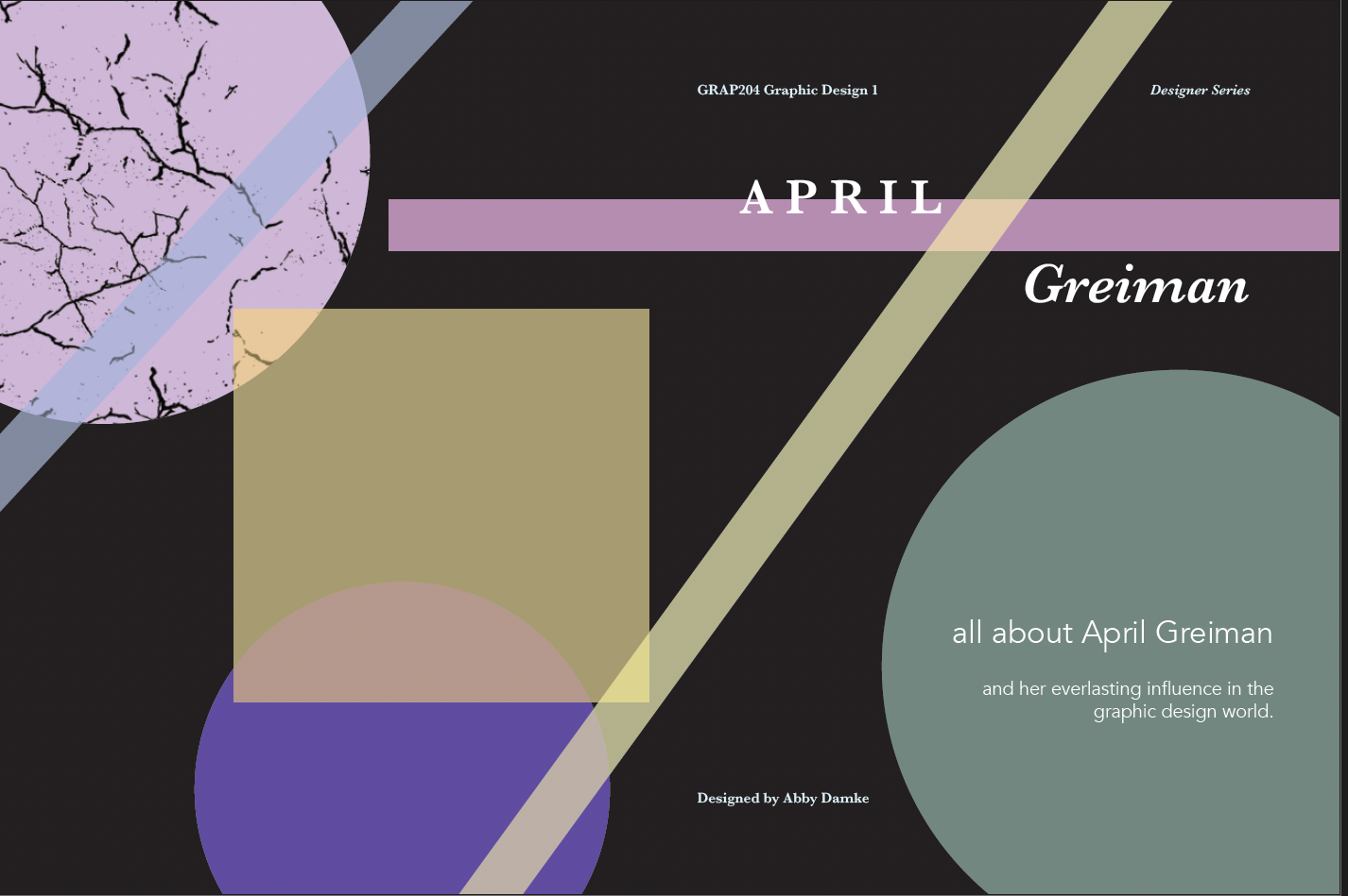
Above is a wrap-around cover for the Designer Series, showcasing the well-known graphic designer April Greiman. The use of vernacular imagery and layering is an homage to the work created by the designer, giving it a unique and recognizable feel. An image of Greiman is used on the cover to better showcase the designer and allows a face to a name, and fits the standard magazine cover showcasing the person who is highlighted.
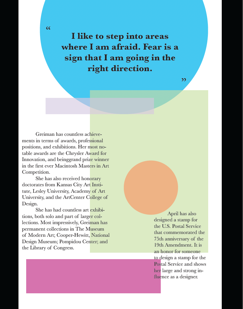
Above is a 2-page spread with a written biography about Greiman, including education, influence, and achievements. The layout is simple to better accentuate the type and prevent distractions. A quote is used to create ties to the designer as well as accentuate her as a person. Another image of her is used, as well as a feature of her work to break up the text.
VERSION 3
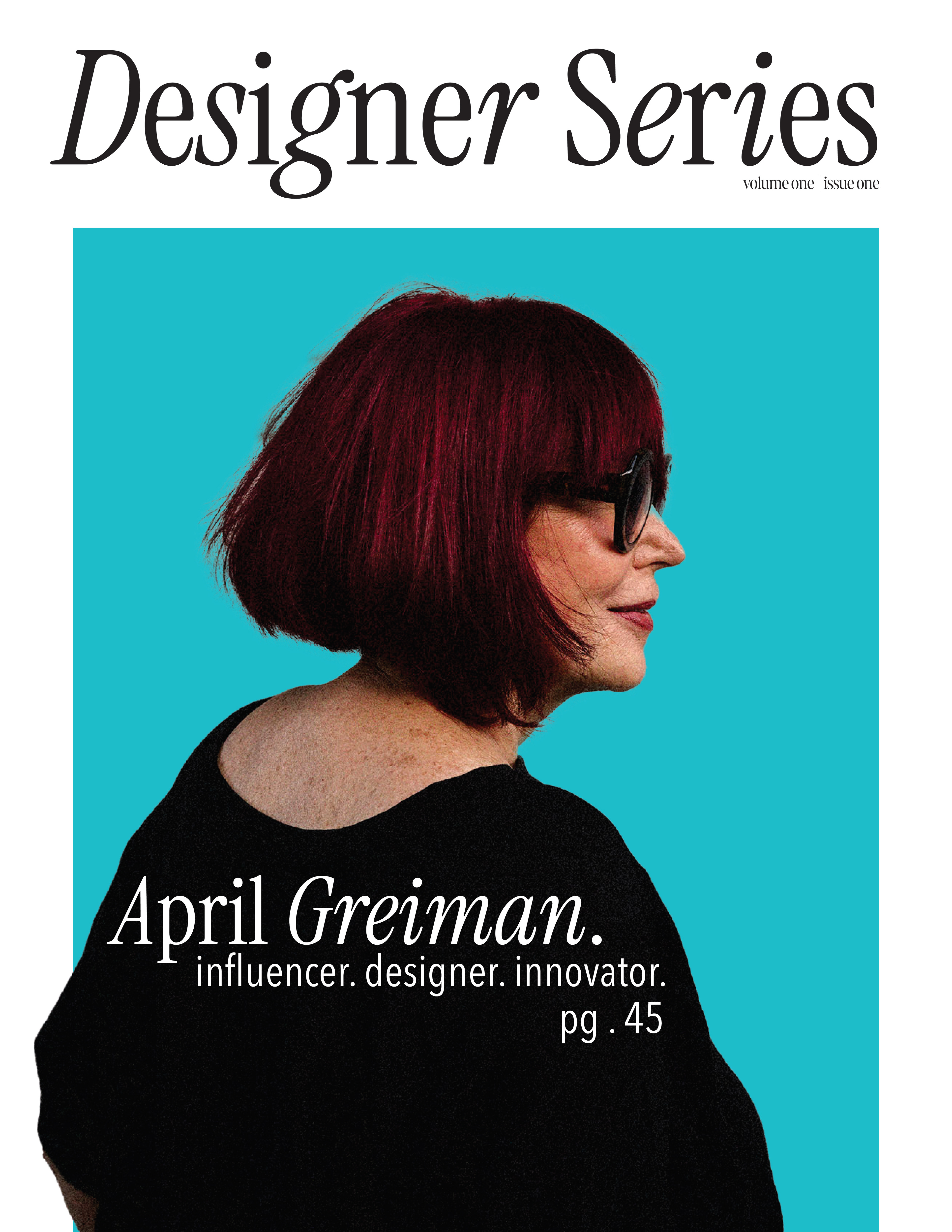
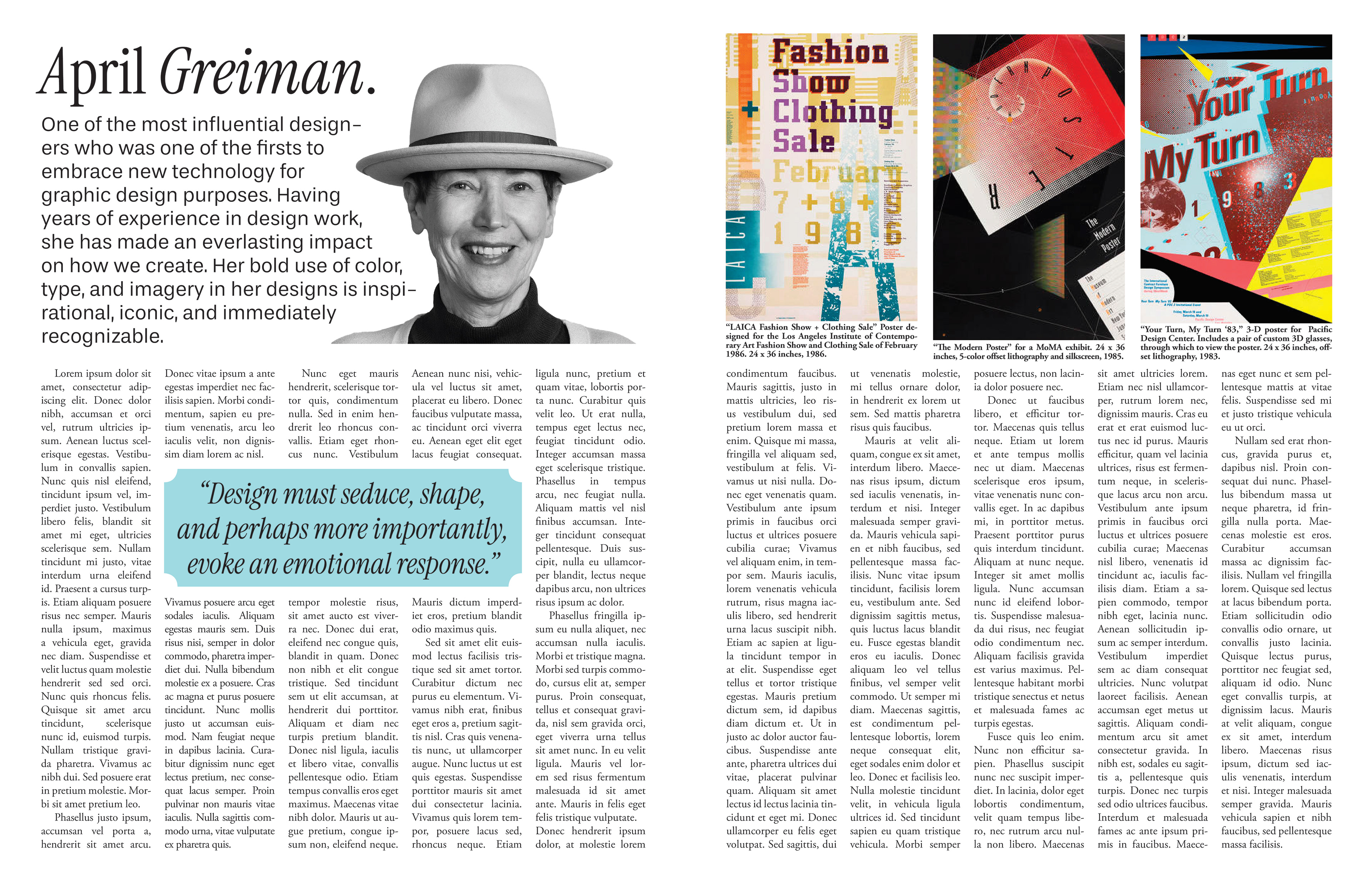
My rendition this time around focused more on the style guidelines a magazine may have, rather than making it match the artist it is covering. The cover is simplistic and has strong focal points, with the blue background, Greiman, and light simple text that counters the dark background of the shirt. For the interior spread, I focused on another photo of her, an informative blurb, and used Lorem Ipsum filler text to work with, rather than focusing on writing a piece as well. I kept the photos at the top to keep the text cohesive, and also included a drop quote with the same blue from the cover, but at a lower opacity. The photos on the right hand page are fitted to be the same size, and are large enough that they attract the eye but don't distract from the text below, and lines up with the portrait photo on the left hand page. I also differed from the previous edition by having more columns, as a traditional magazine is set up. Having five columns instead of two make it look more realistic and allow for a clean and professional appearance.
