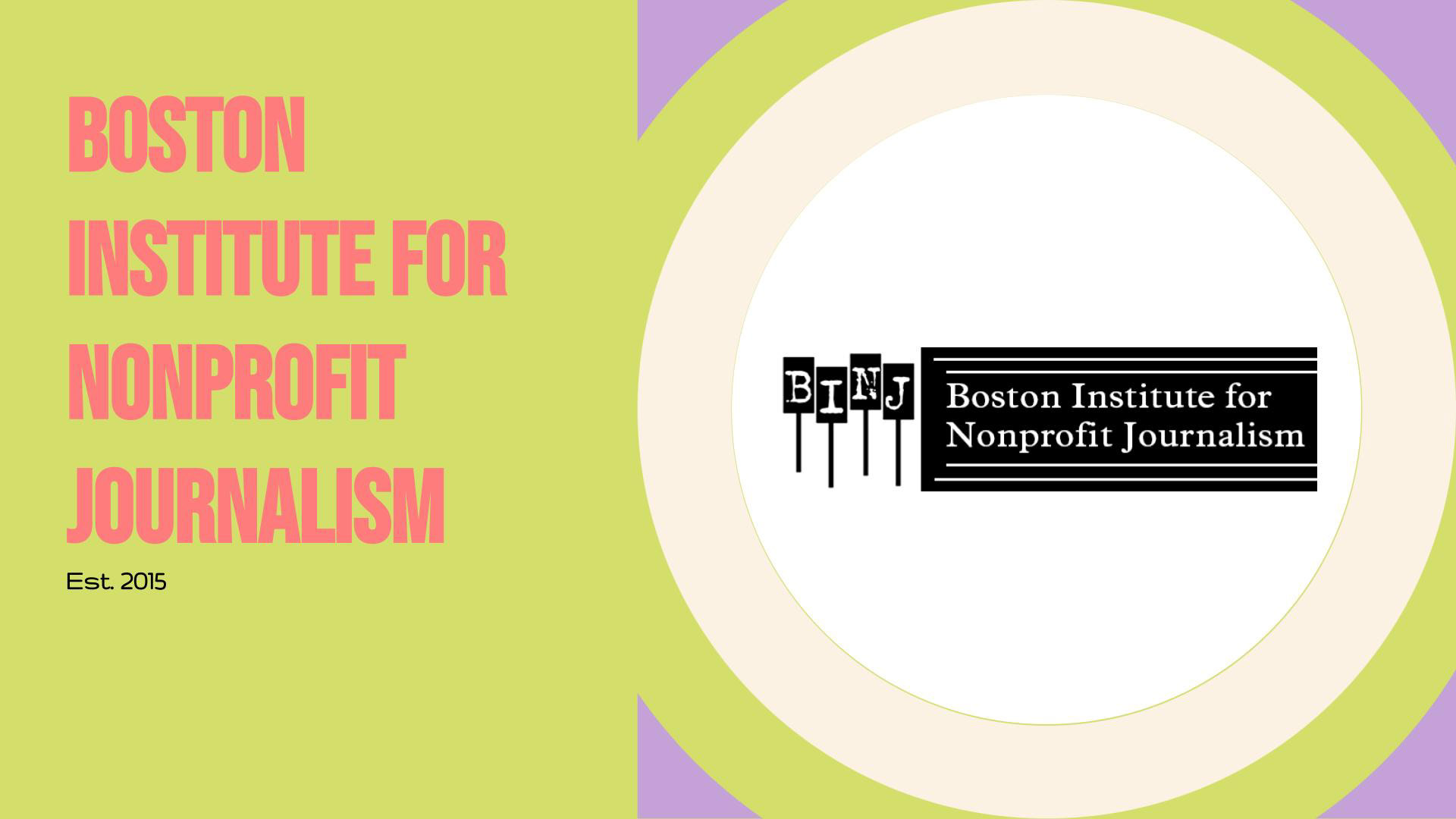
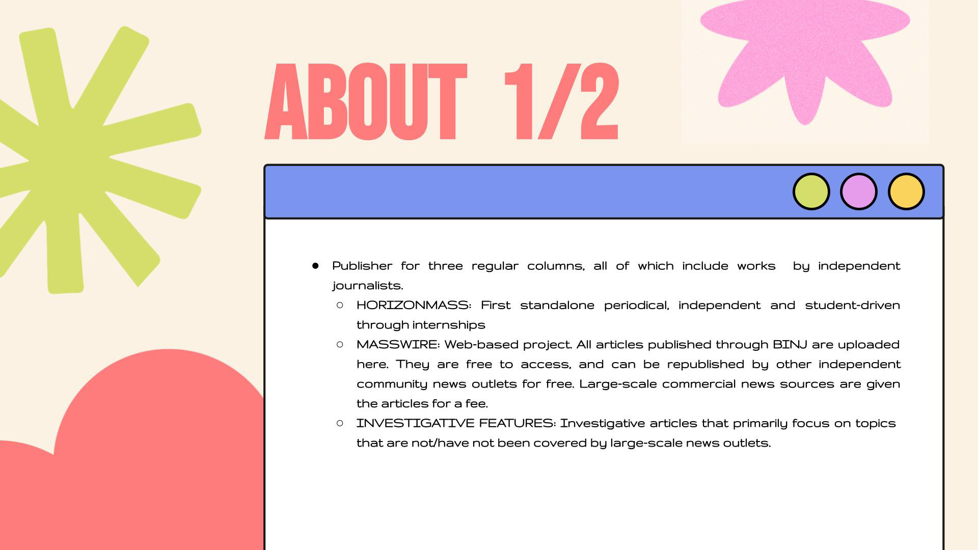
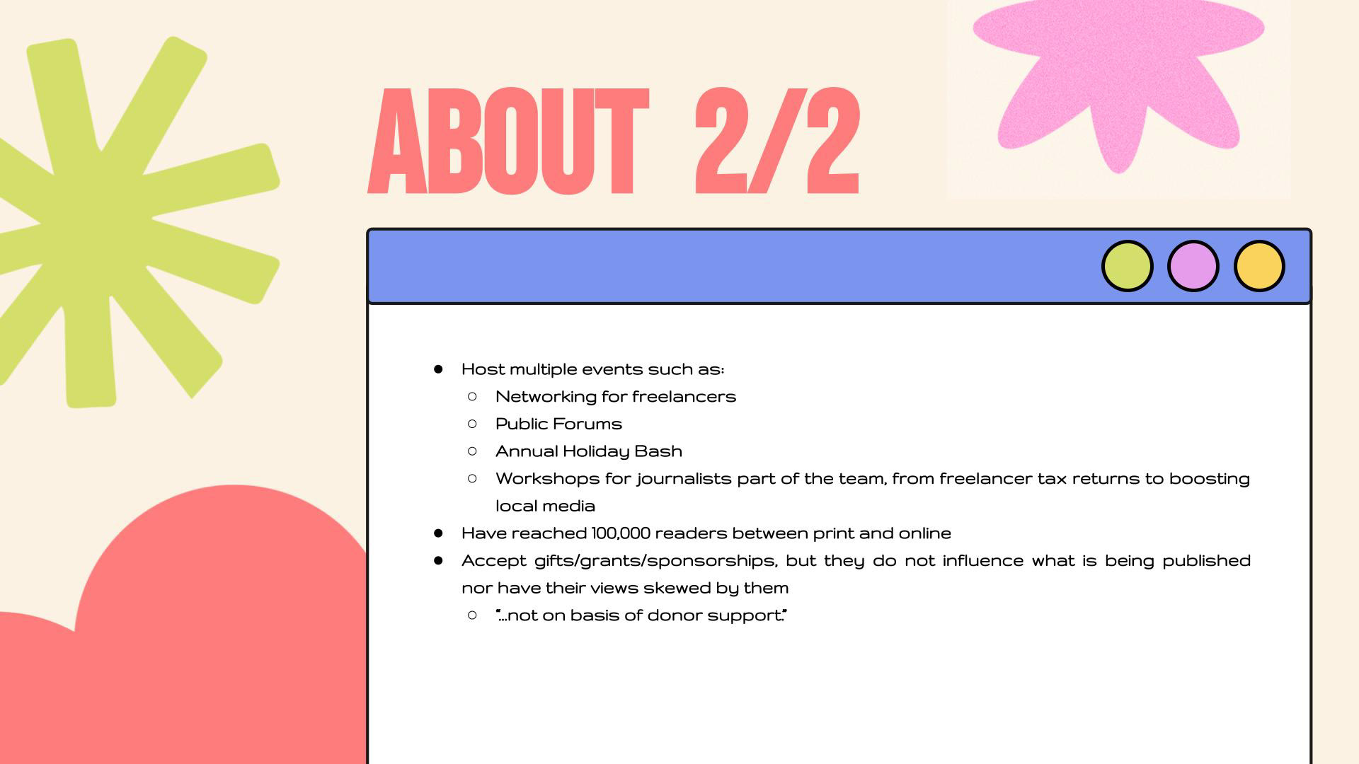
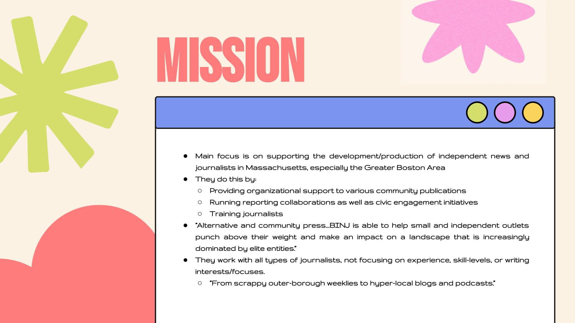
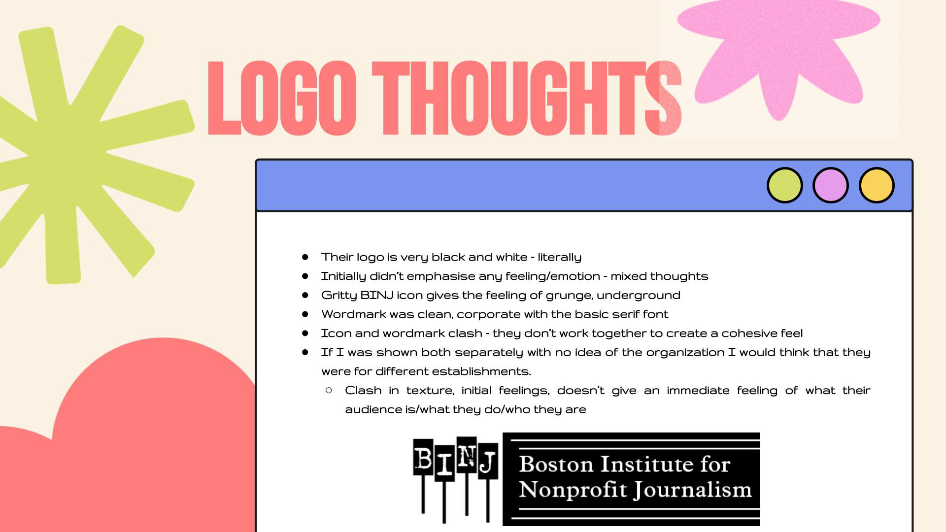
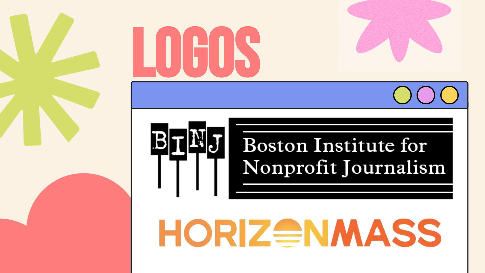
For my branding course, I was asked to find a non-profit of my choice in the Greater Boston Area that we felt had poor design and redesign its branding to better fit its message. I chose the Boston Institute for Non-Profit Journalism (BINJ). I felt their design work was outdated and could be revamped to fit the underground/alternative independent journalism energy I felt when researching them.
Below is the case study that contains the final renditions of the logo and color palette. Implementation as well as a motion graphic are included as well. Under the case study is a breakdown of the process that led to the case study development, such as sketches, logo drafts, and type studies.
*NOTE: This case study was created in Figma, but I've encountered some technical difficulties with trying to embed the Figma Prototype and connect a link button, so a JPG version is available to view here. Some videos, including a motion graphic, are presented in the case study that will not be viewable in JPG format. For the time being, there is a copy-and-paste link to the Prototype that works! I deeply apologize for this inconvenience and I will try to have it solved as quickly as possible. Thank you!*
https://www.figma.com/proto/zL0TJlxiYfvjUA7NyLOo1y/BINJ-Case-Study?page-id=0%3A1&type=design&node-id=1-2&viewport=261%2C-14%2C0.35&t=wMrTFswRHuMKglyz-1&scaling=scale-down-width&mode=design
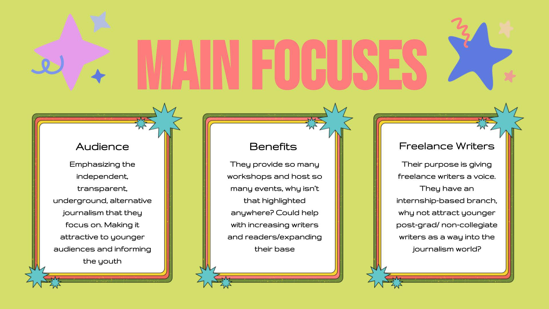
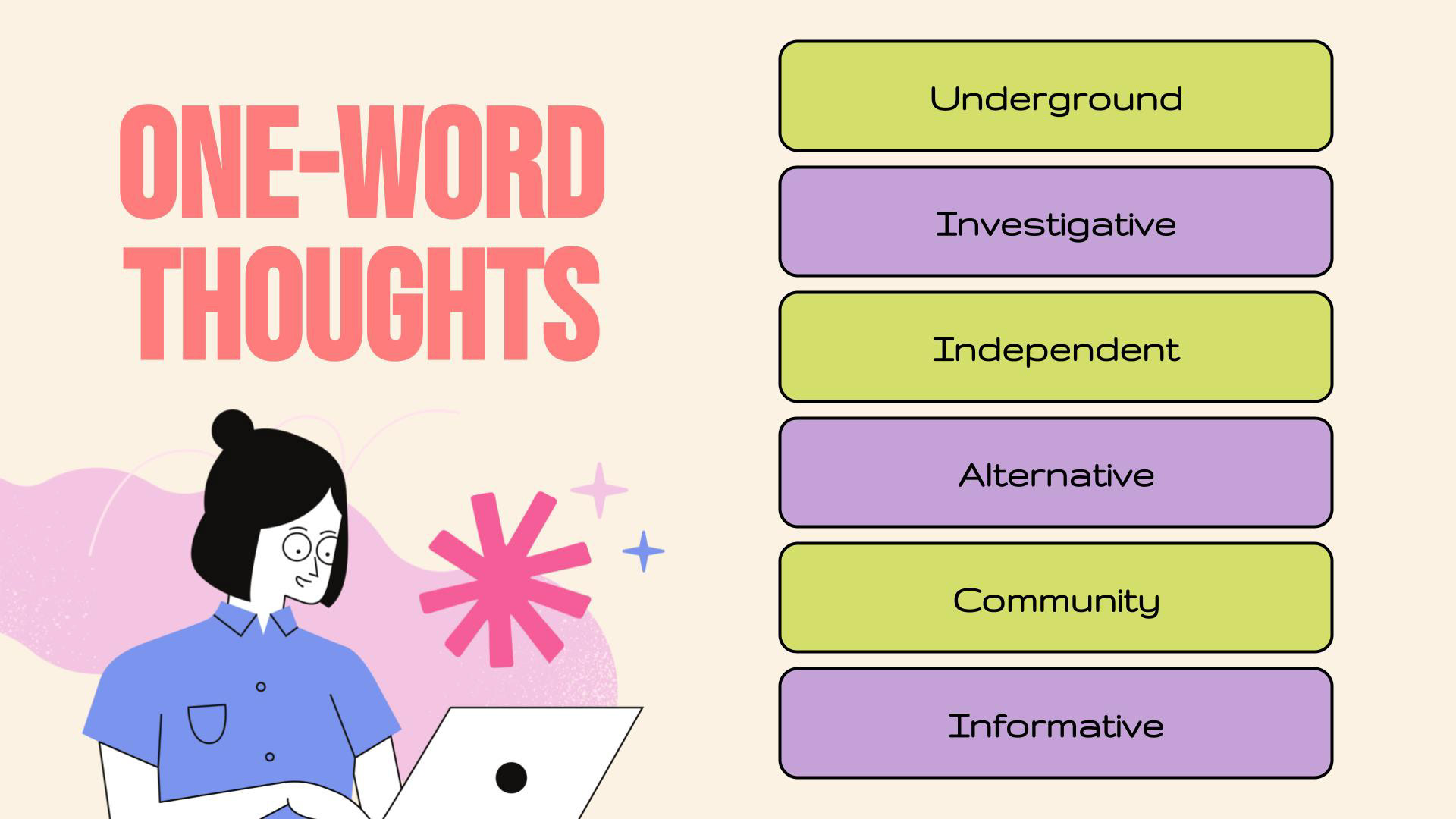
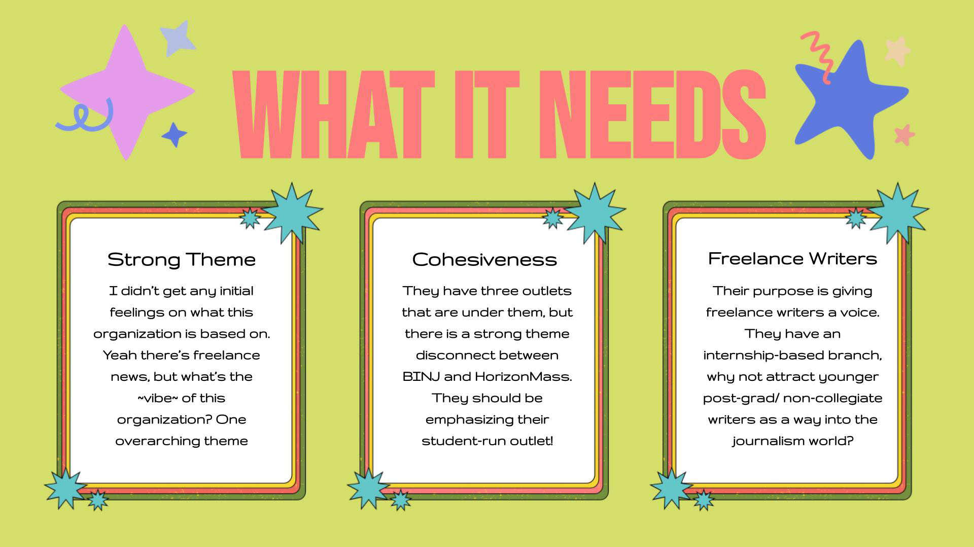
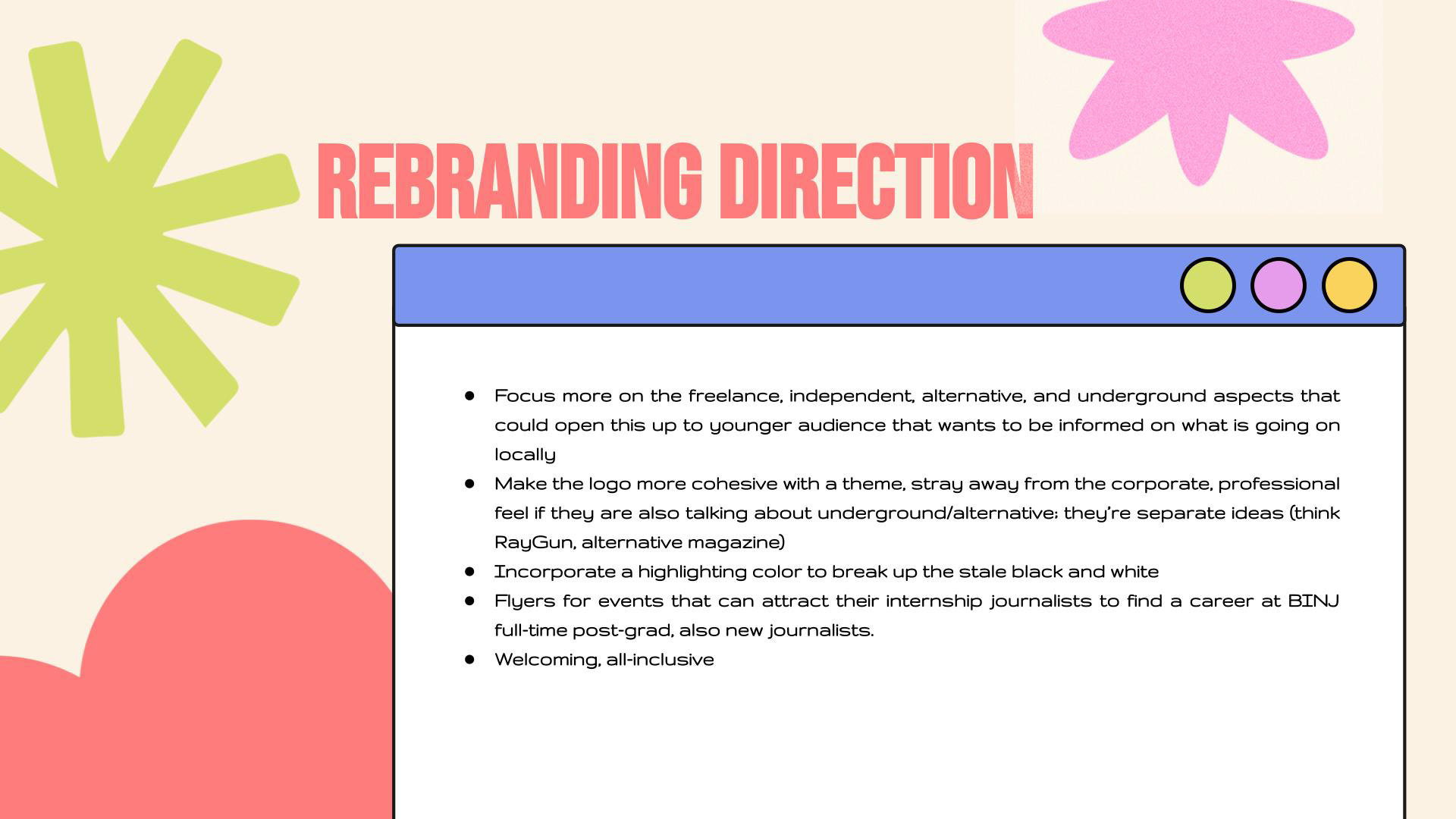
Above is the presentation created to explain what BINJ is about and their mission, and then provide my input regarding the current logo and how it can be updated, the main rebranding focuses, one-word thoughts, etc.
(Presentation template courtesy of SlidesCarnival)
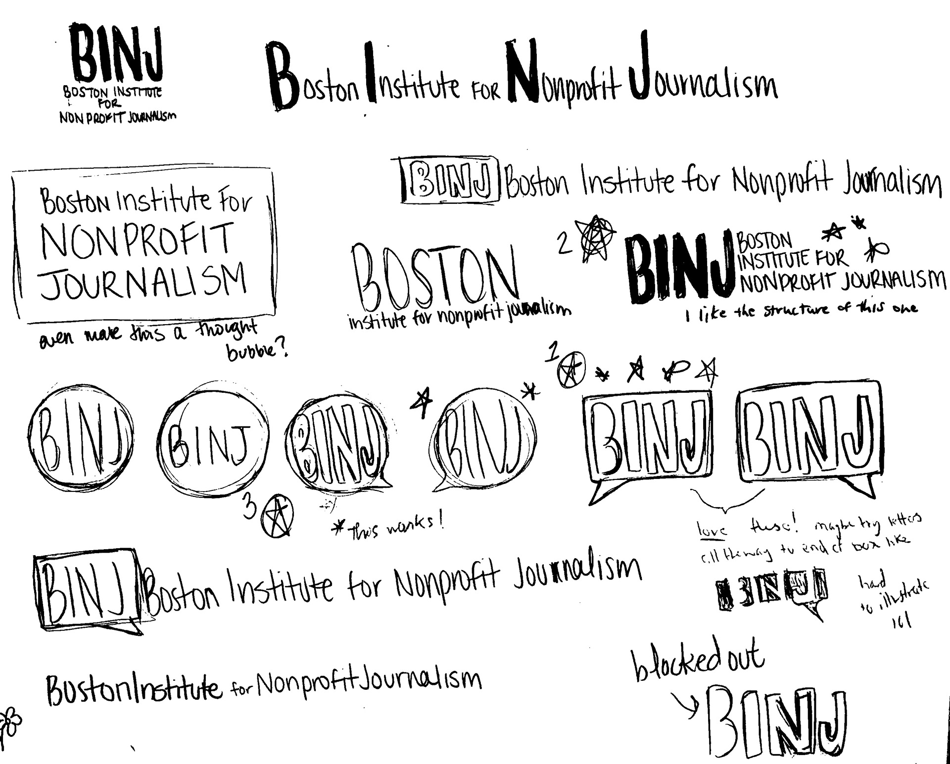
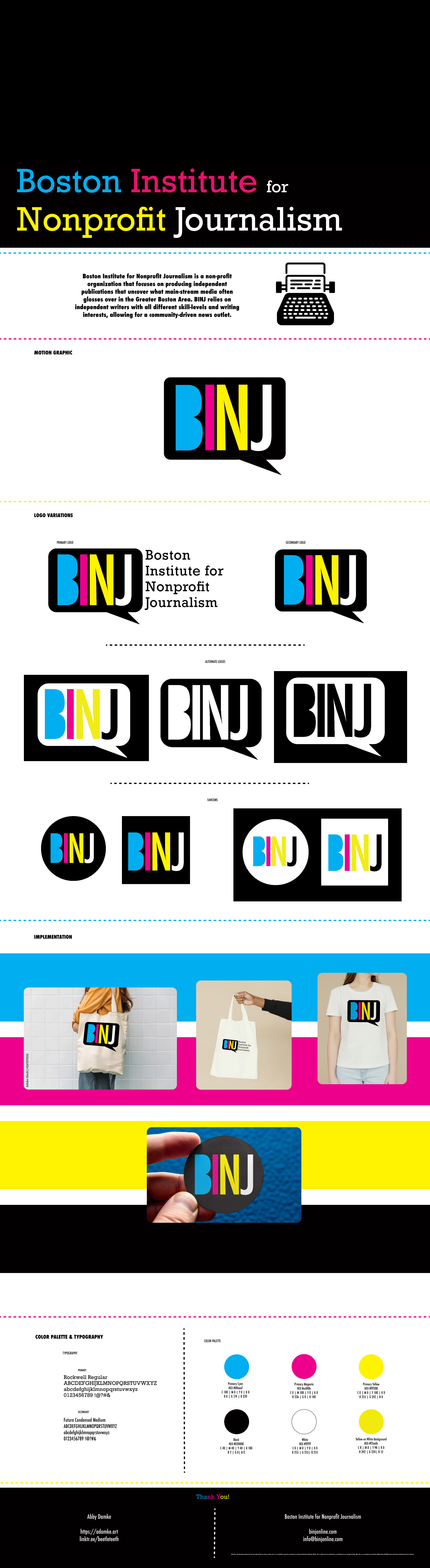
After the initial research process, I began sketching out logo variations that I felt agreed with the research and personal rebranding direction for BINJ. I wanted to emphasize the abbreviation, as well as include the full name of the organization for the primary logo. This primary logo could also be reduced to create secondary logo variations that singled out the abbreviation. This scanned-in sketch also includes critiques from peers, as well as pointing out which ones they felt worked the best.
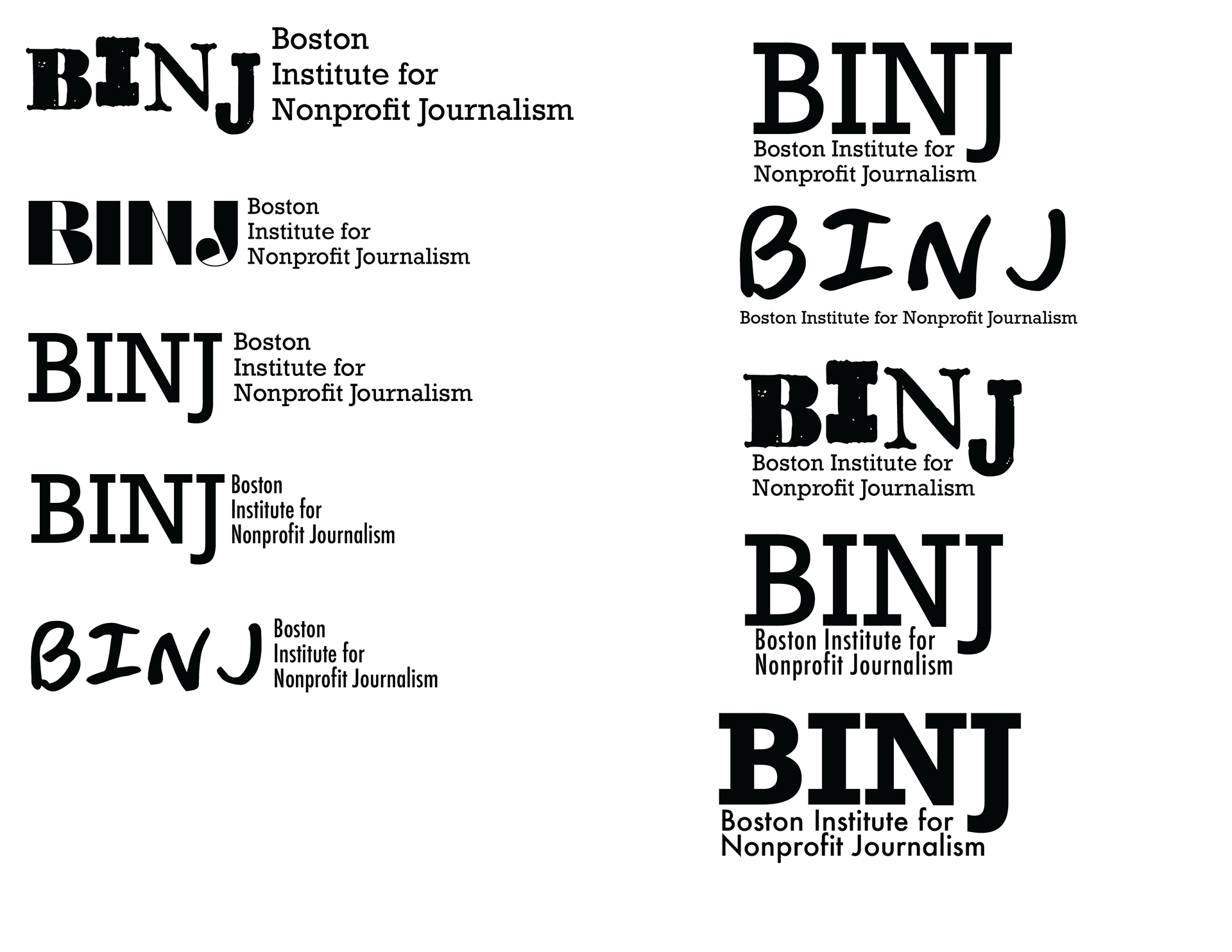
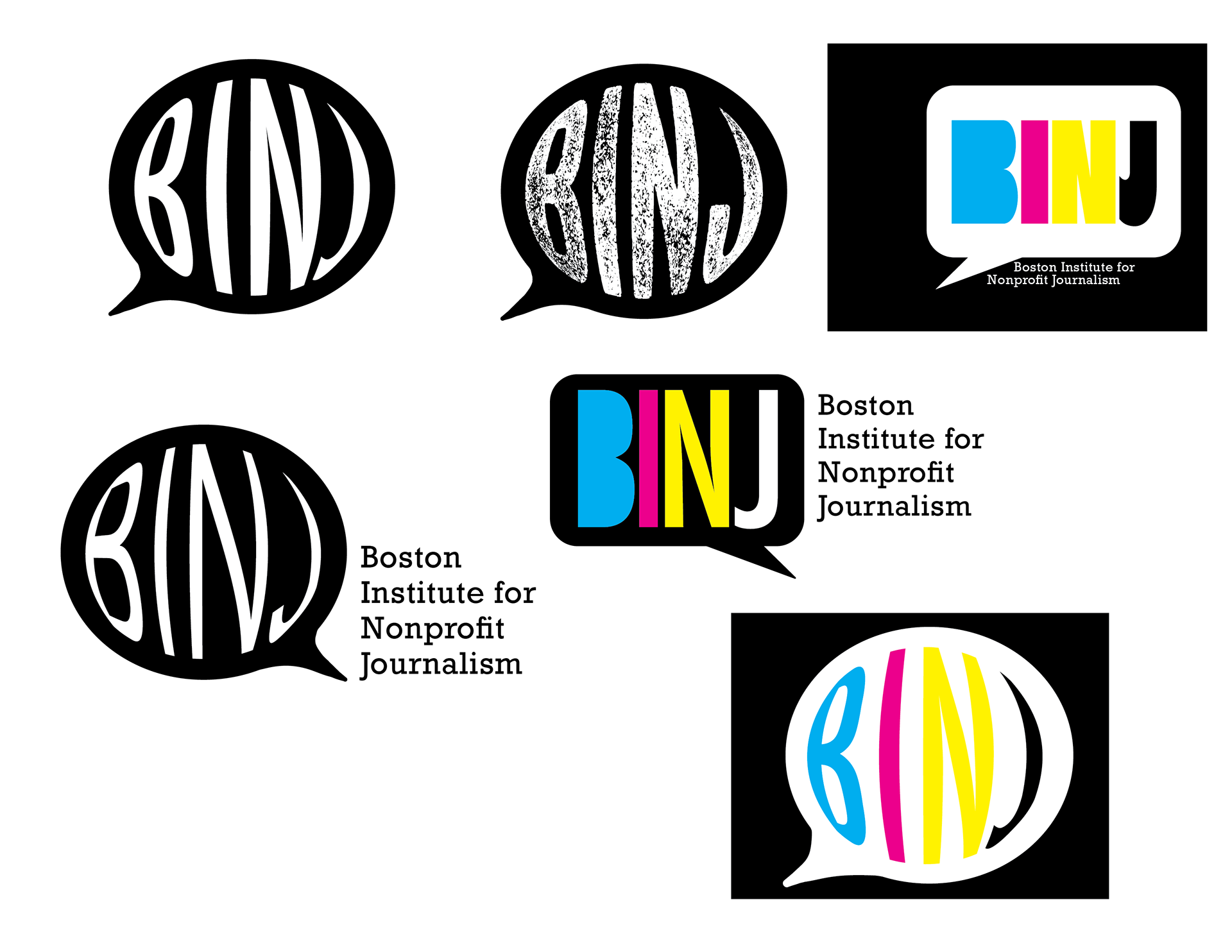
After sketching out the ideas, I was able to do a type study to determine which typefaces to use for the logo. I knew I wanted the abbreviation type to be big and bold, while the written-out name was smaller, but still stood out from the logo. I was focusing on doing a slab serif or mono typeface, commonly used/associated with writing and typewriters, which would align with the non-profit being an independent journalism collective.
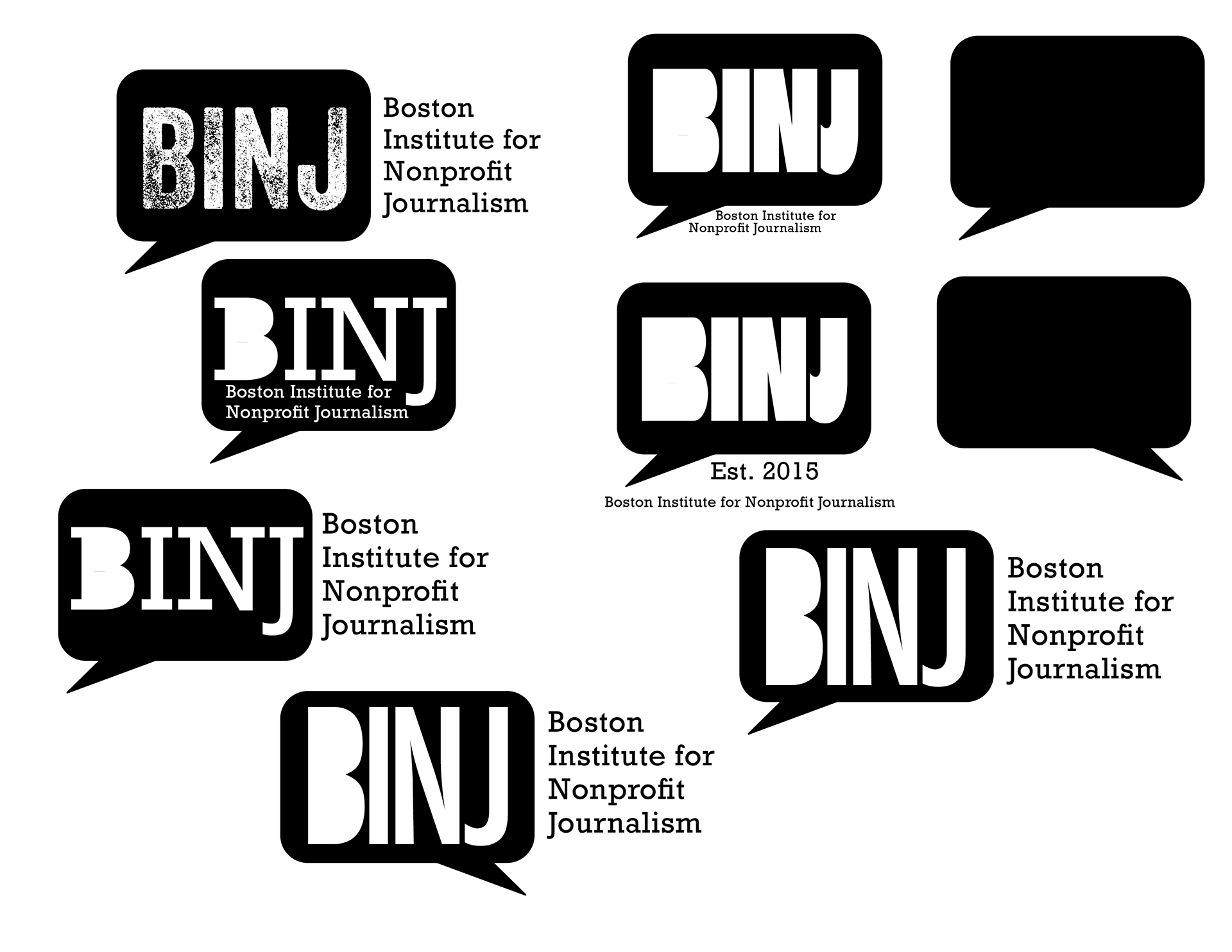
From the initial sketches, I was able to bring the top choices into Adobe Illustrator to create various renditions of the top two choices, the rounded squared speech bubble and the circle speech bubble with the text warped to it. After creating the icons in Illustrator, I applied the top type choices to multiple versions, experimenting with what typefaces worked well together.
After creating the black-and-white rendition of the logo, I decided to experiment with adding color. I knew that I wanted to do the abbreviation in CMYK (cyan, magenta, yellow, black) because that is the color process traditionally used with printing, and because journalism is associated with newspapers and printed stories, I thought this would be a strong choice.
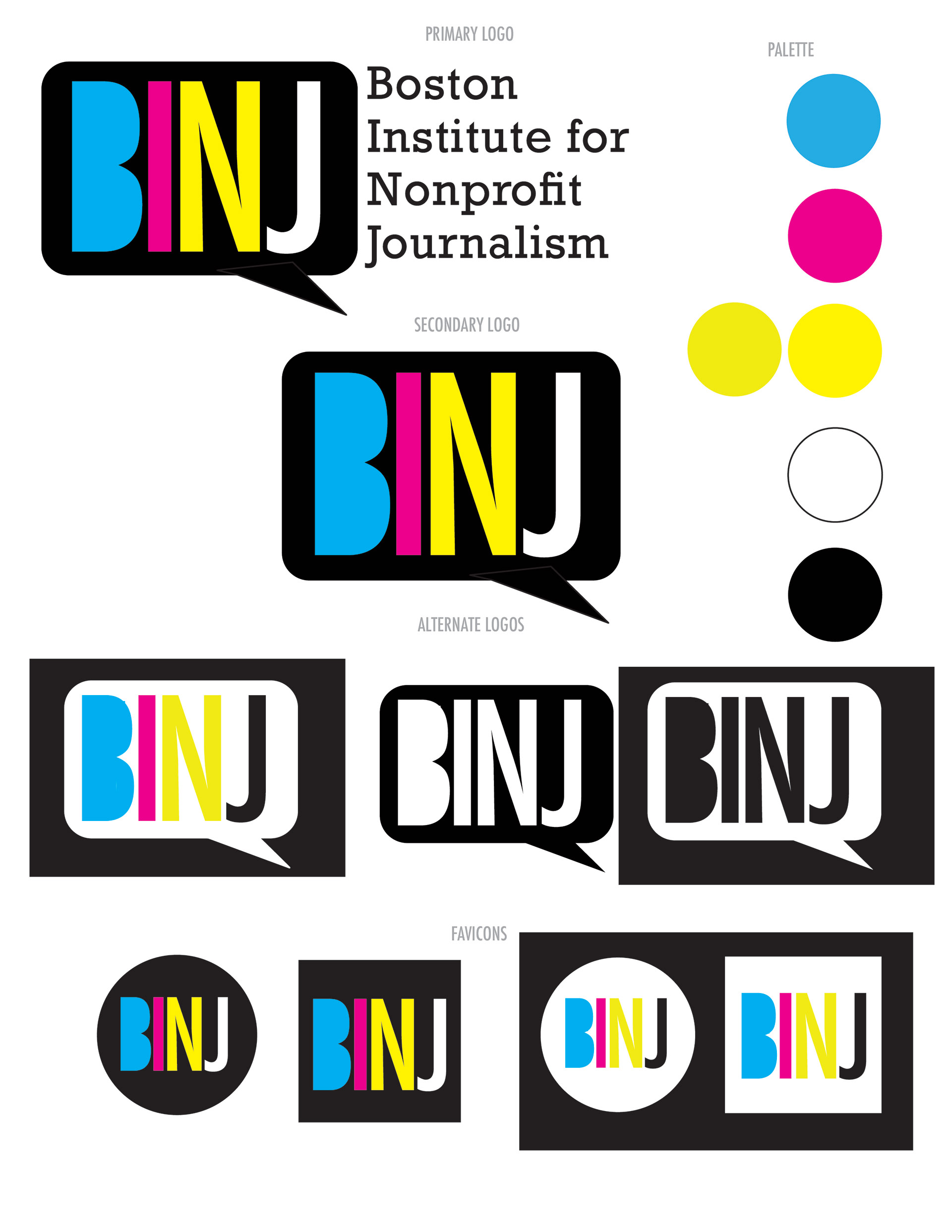
After determining the final logo rendition to continue further, I created a single-sheet logo swipe that showcases the primary and secondary logos, alternate logos, favicons, as well as the color palette.