Logo project for a Branding course.
Project Outline: We were asked to pick an ordinary, everyday object and illustrate it in various styles. We then selected our favorites, and refined them in Illustrator, creating our icon. We were also asked to do type studies with 25+ typefaces, as well as create 24 logo designs incorporating the icon as well as the top typeface choices.
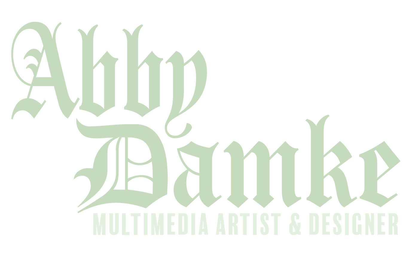
In the end, the deliverable was the chosen icon and type shown blown up and at a reduced scale.
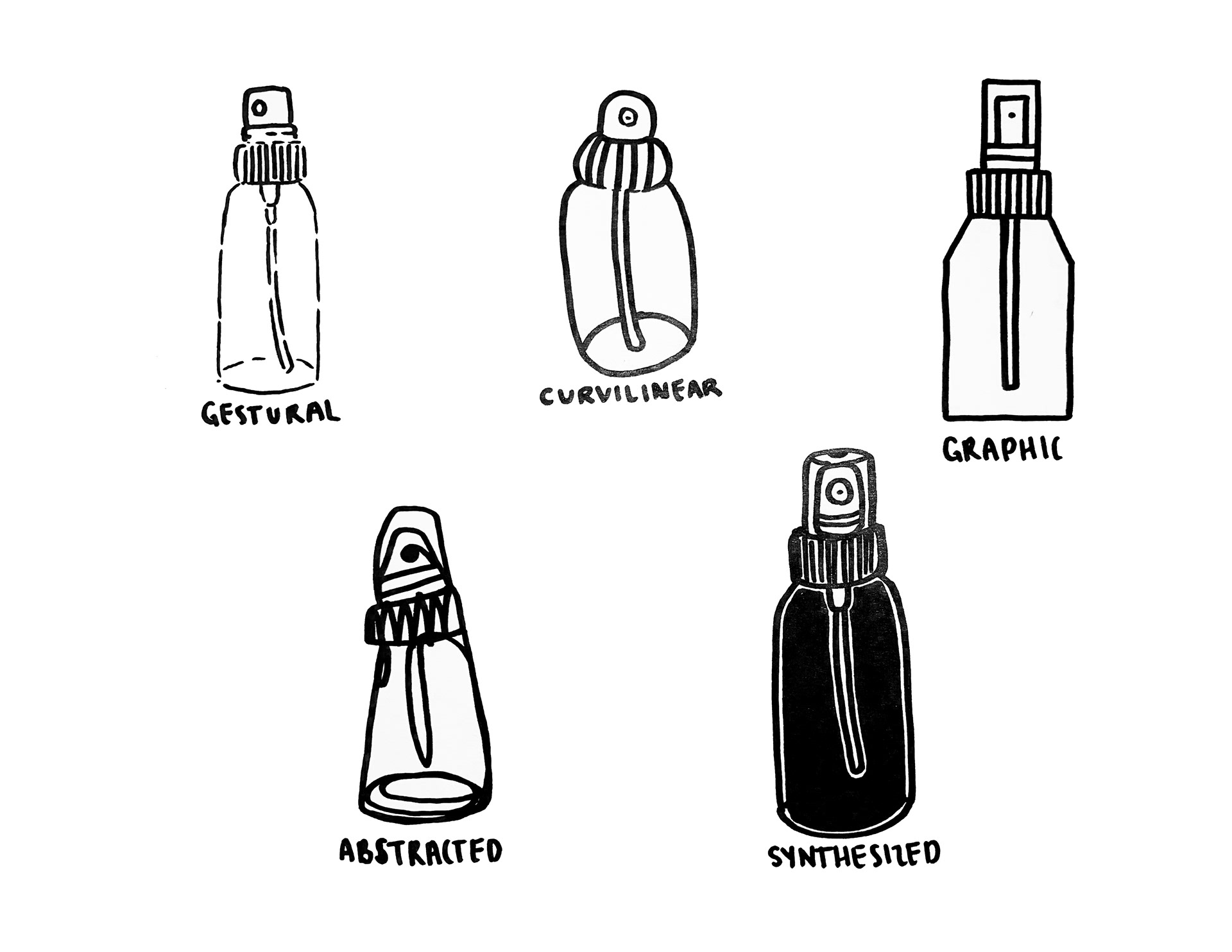
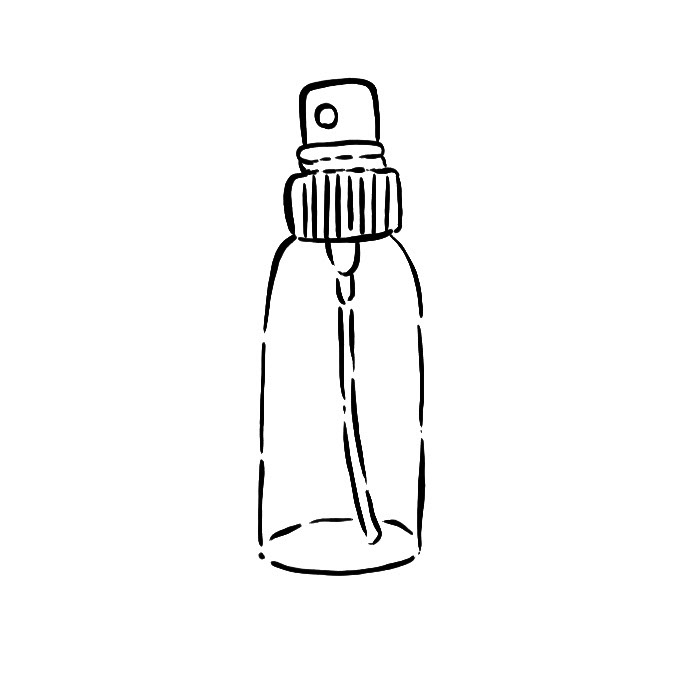
For my item, I chose a spray bottle. The left image depicts the final rendition of each style. I had selected the Gestural style illustration as the one to continue with due to it being the most compelling and unique depiction of a spray bottle compared to the other options. The line breaks also helped with allowing the bottle to be more expressive. The goal was to make this ordinary spray bottle the symbol for a premium, eco-friendly glass spray bottle.
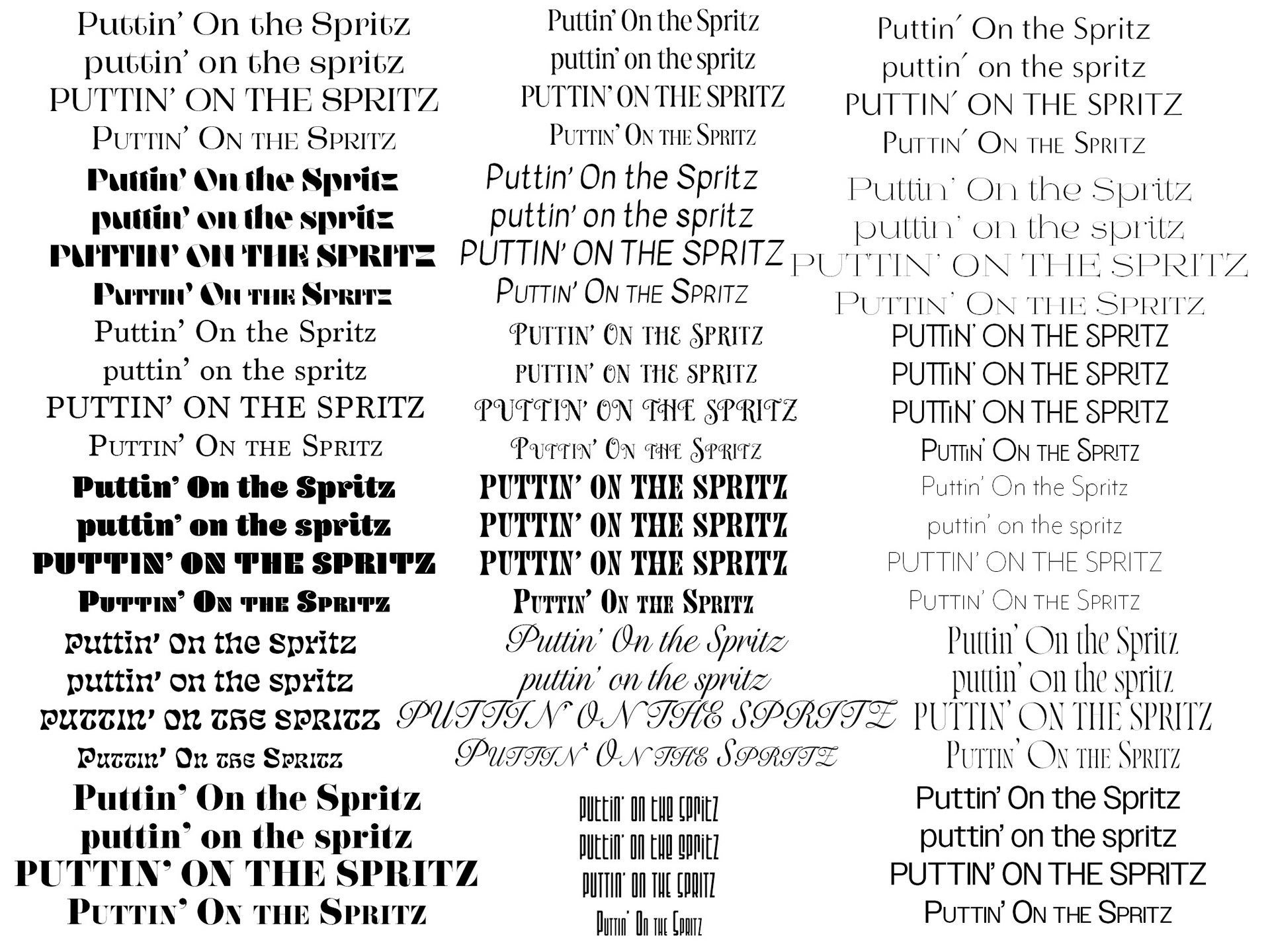
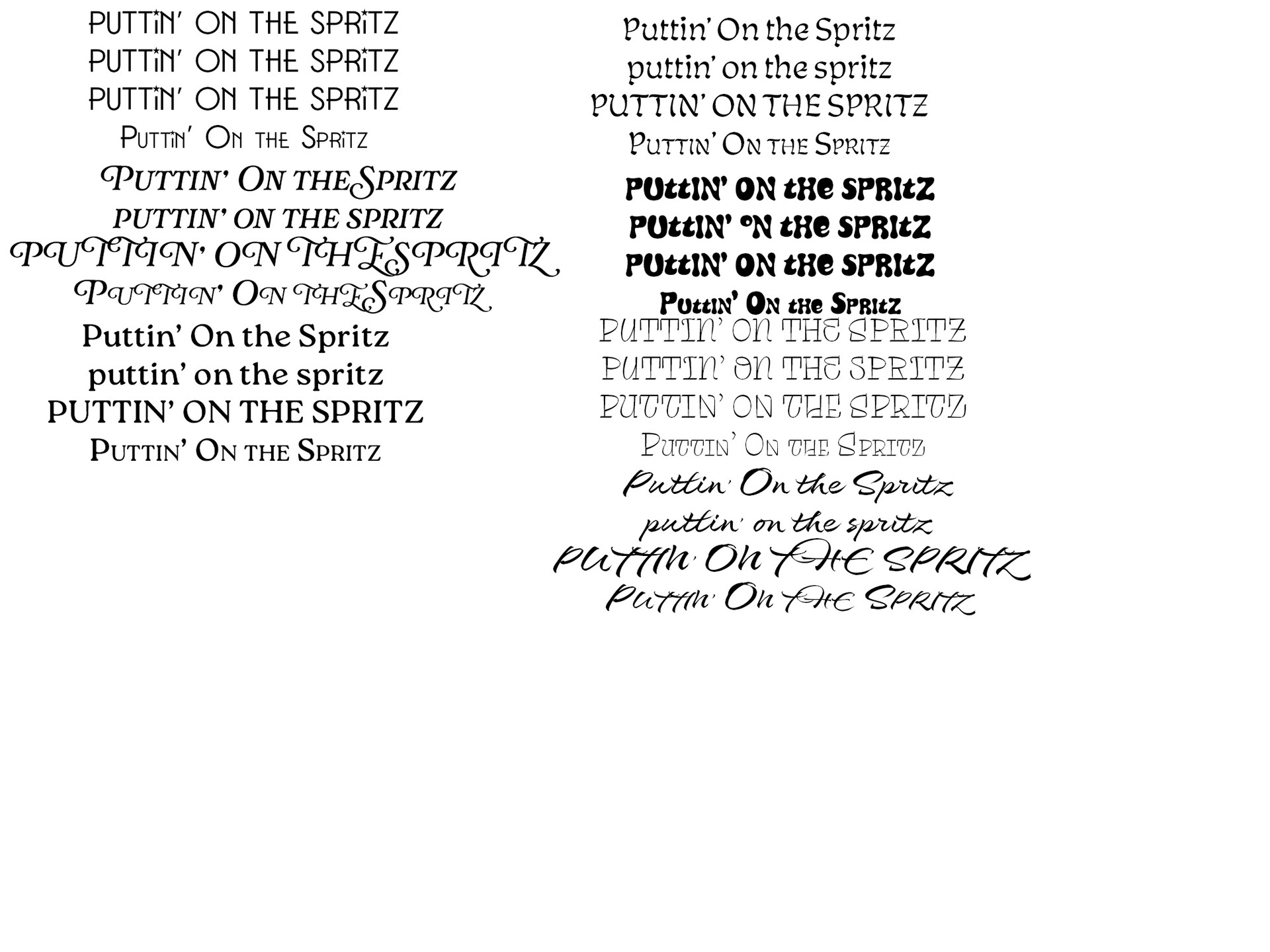
The next step was to do various type studies to determine which would look best based on my initial ideas for the name and the icon chosen. I was looking for typefaces that gave off a feeling of vintage sophistication while also having modern charm, consistent with the overarching theme of an upscale glass spray bottle that may be considered a higher-end product.
I experimented with each typeface by putting them in title case, all lowercase, all uppercase, and small caps. Doing this helped eliminate some type choices as well as determine the best typefaces for this project.
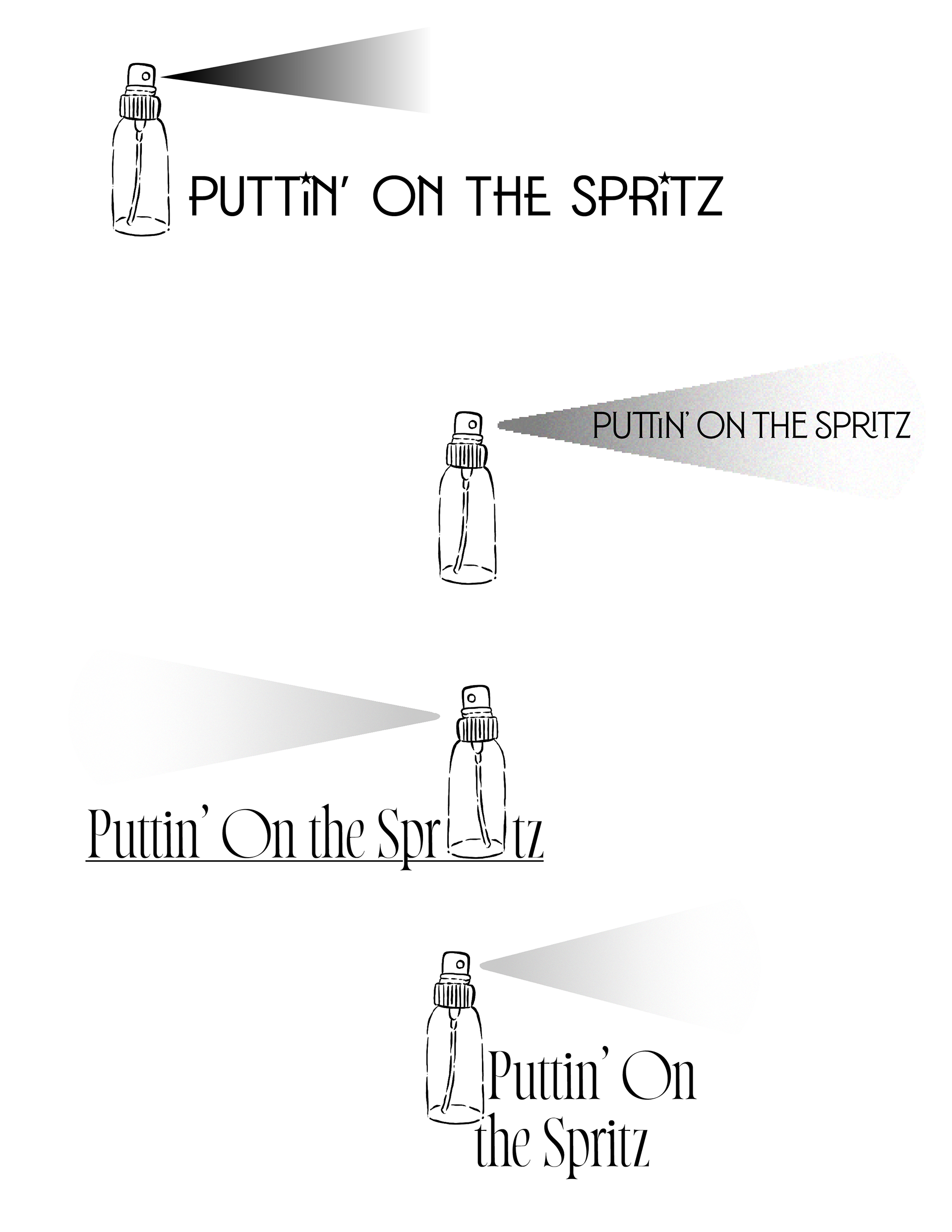
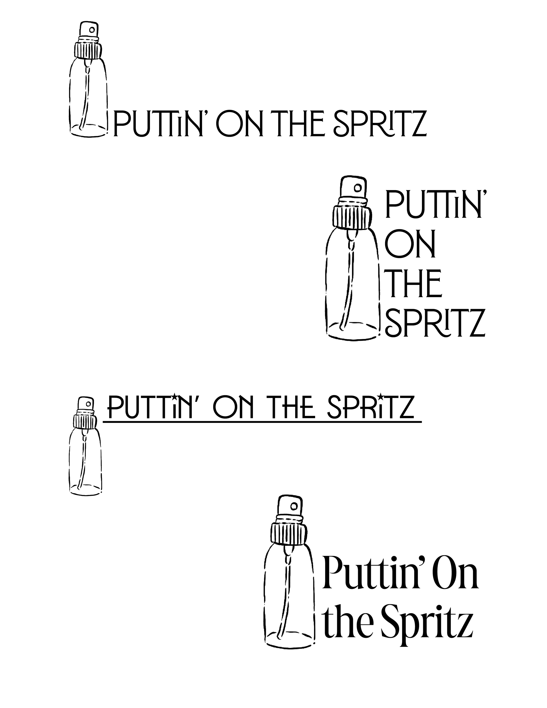
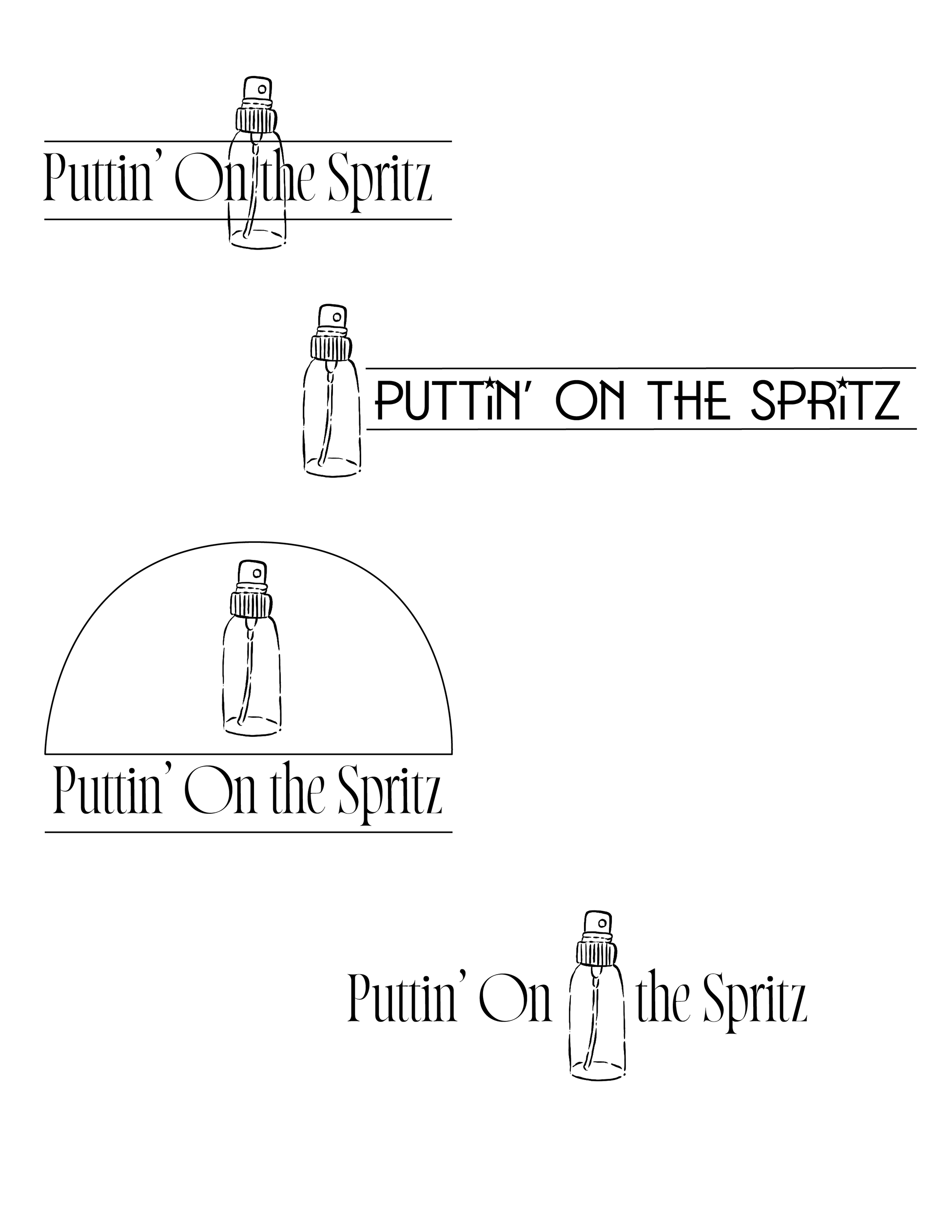
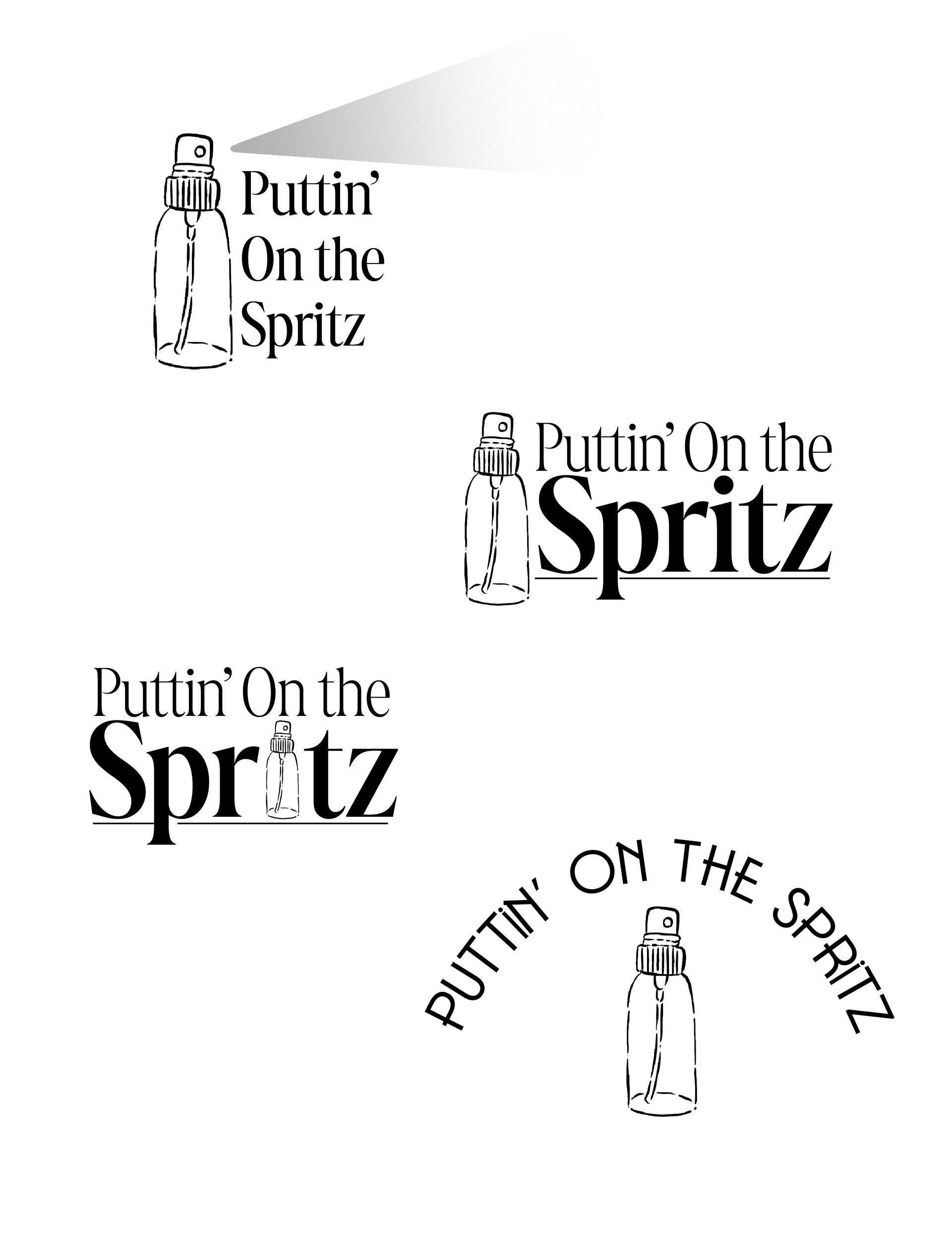
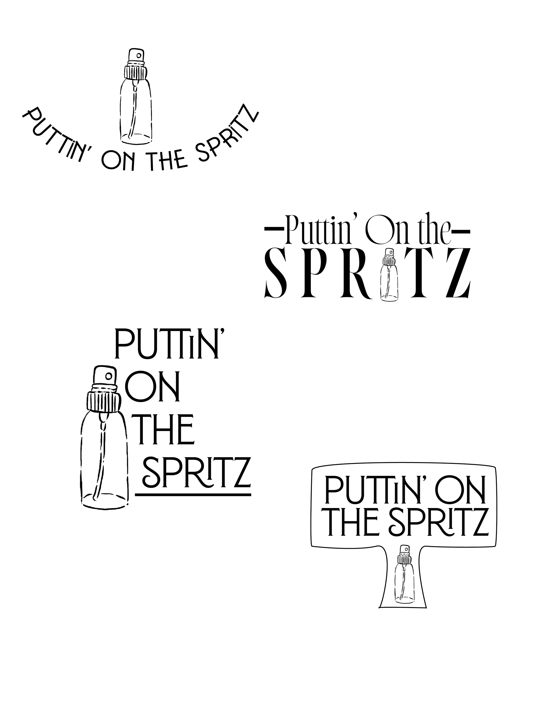
Next, I took the top typeface choices and the icon and experimented with combining both to create a logo. My main concerns were making sure that the spray bottle didn't lose a lot of detail, while still keeping that initial feeling of vintage elegance with a modern flair.
Throughout this process, I made sure that the logos maintained distinctiveness, even when repetitively using typefaces and a single icon. While doing this, I also experimented with incorporating various design elements, such as lines, containers, and curved text. Doing this expanded the logo options on limited assets, creating a large selection of alternative designs.
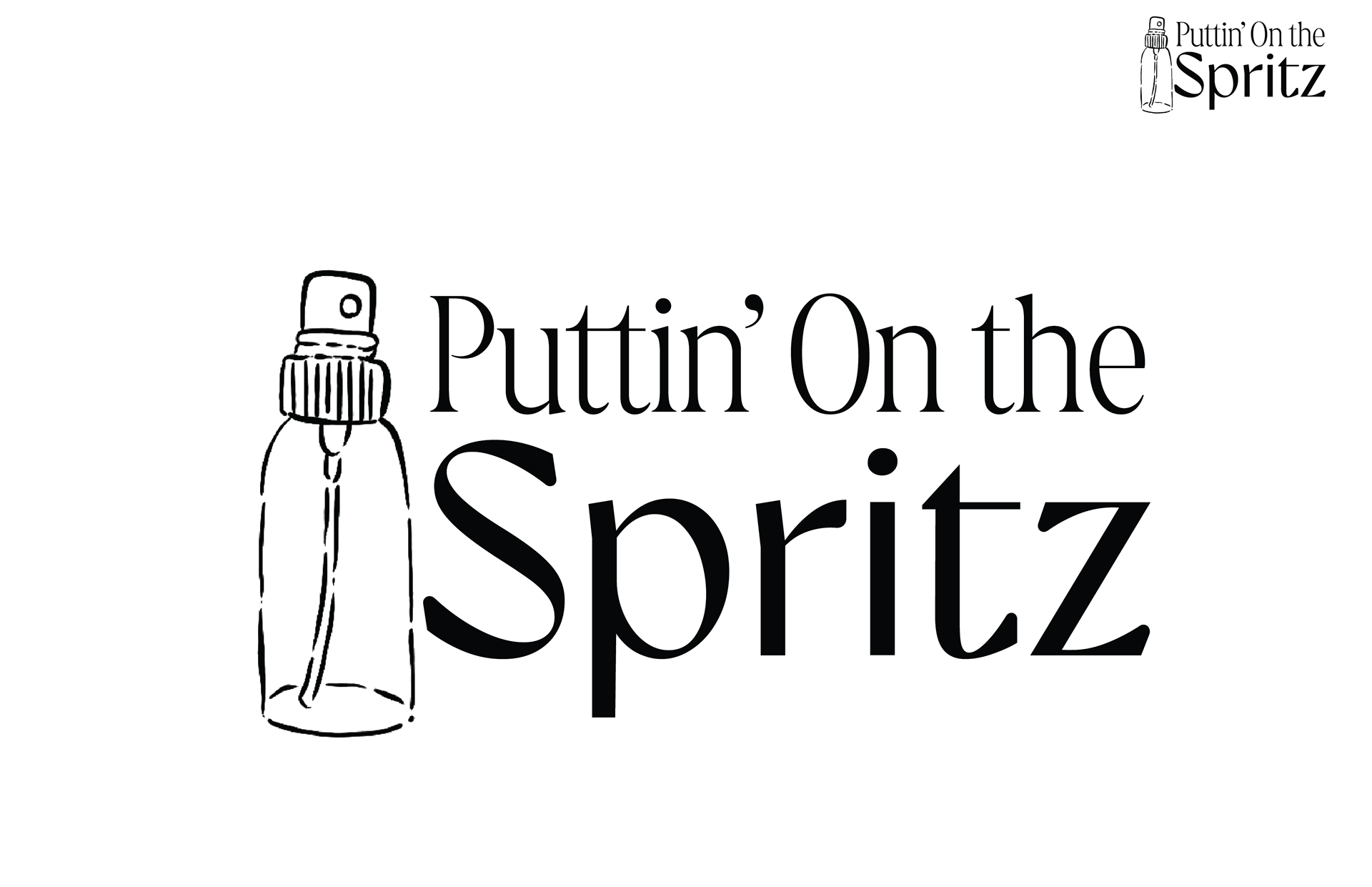
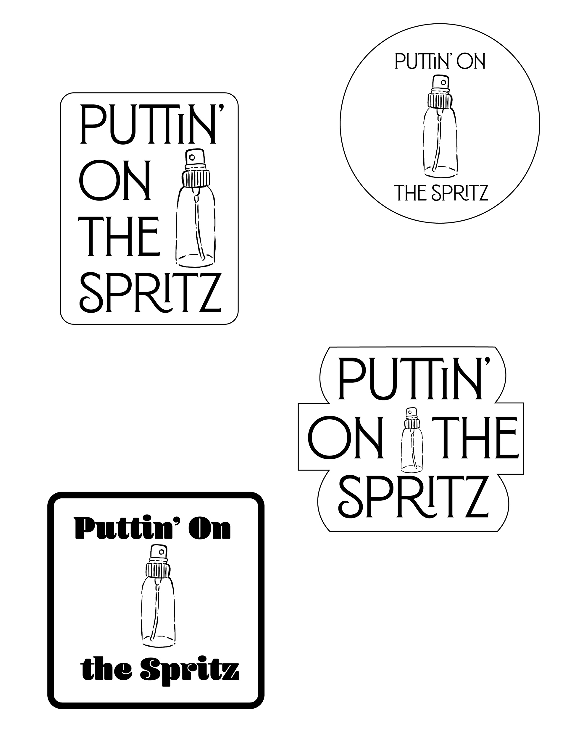
After the critique of the initial logo iterations, a final logo was selected and refined further based on additional feedback. I then scaled it up to larger dimensions as well as a smaller rendition. The size differences show the versatility and easy readability from any size and can be adapted to various sizes and contexts.